Go to
How to configure the Go to component in Ilevia Manager to navigate to another section of the Ilevia Control app, with an example of a trigger component.
Introduction
This component is used to speed up navigation in the Ilevia Control app: it lets you move from one section to another with a simple click on the “Go to” component icon, placed in the map-based interface.
Use cases
You can use this component to create a link to another page in the project, so as to speed up navigation.
Component properties
The component title and icon are fully customizable. We recommend consulting the “Common properties” guide.
GUI
This component was created using the Graphic UI gateway.
You can refer to the chapter “Gateway / protocols” for further information.
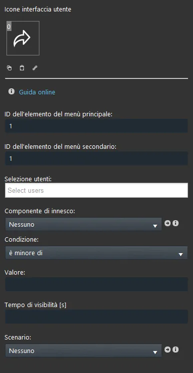
Primary menu item ID: enter the coordinates relative to the primary menu;
Secondary menu item ID: enter the coordinates relative to the secondary menu;
User selection: select the users who will have access to this component;
Trigger component: you can select one of the following components: Switch, Info, Colored info, Text info, Slider, Option list, Adjustable value, Setpoint, Shutter, Scenario, Pushbutton, to trigger the event and change its related state (0/1);
Condition: lets you decide the conditions to enable the trigger, for example: if the value (text field below) is lower than 0, go to;
Value: the value that the trigger component must have for the condition to be met;
Visibility time [s]: how many seconds the window remains visible.
Reminder before continuing:
Download and install the Ilevia Logic plugin to enable plugins (link);
After uploading the Ilevia project to the server, wait a couple of minutes for the logic to start.
There are three possible display modes: “Classic”, “Modal”, and “Hidden”. For more information, see the “Common properties” guide.

and

→ Go to icon. Click the icon to navigate to the defined section.
How to set up a trigger component for the Go to component
Step 1:
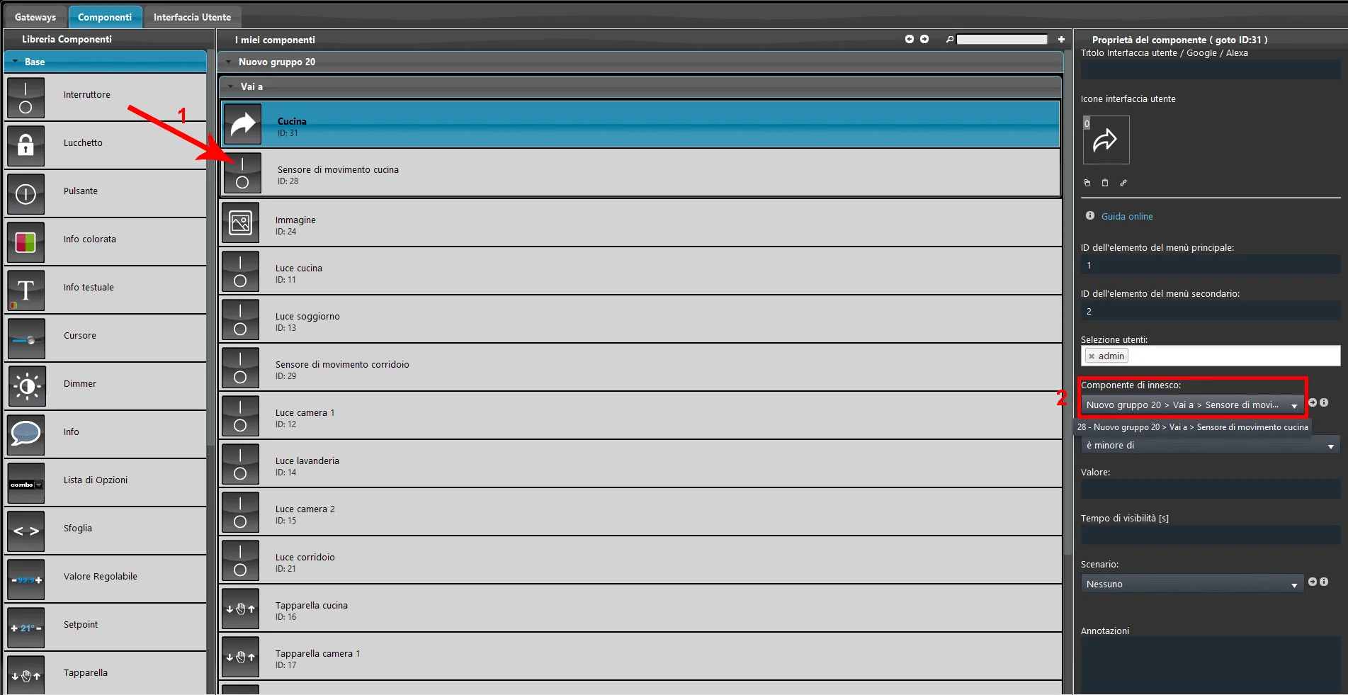
1. Add a new Switch component to simulate a motion sensor.
2. Select it as the trigger component in the Go to component.
Step 2:
1. Set the condition that specifies when the Go to component should activate. The condition can be that the trigger component value is:
Lower than
Higher than
Equal to
2. Set the value that the trigger component must have for the condition to be met.
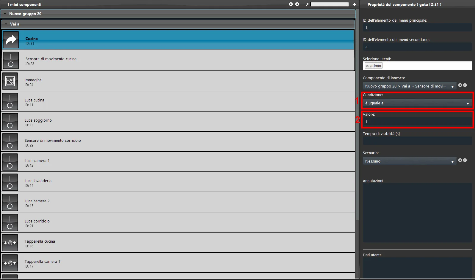
Step 3:
Now add a visibility time: this parameter specifies how long the screen set through the ID coordinates is displayed.
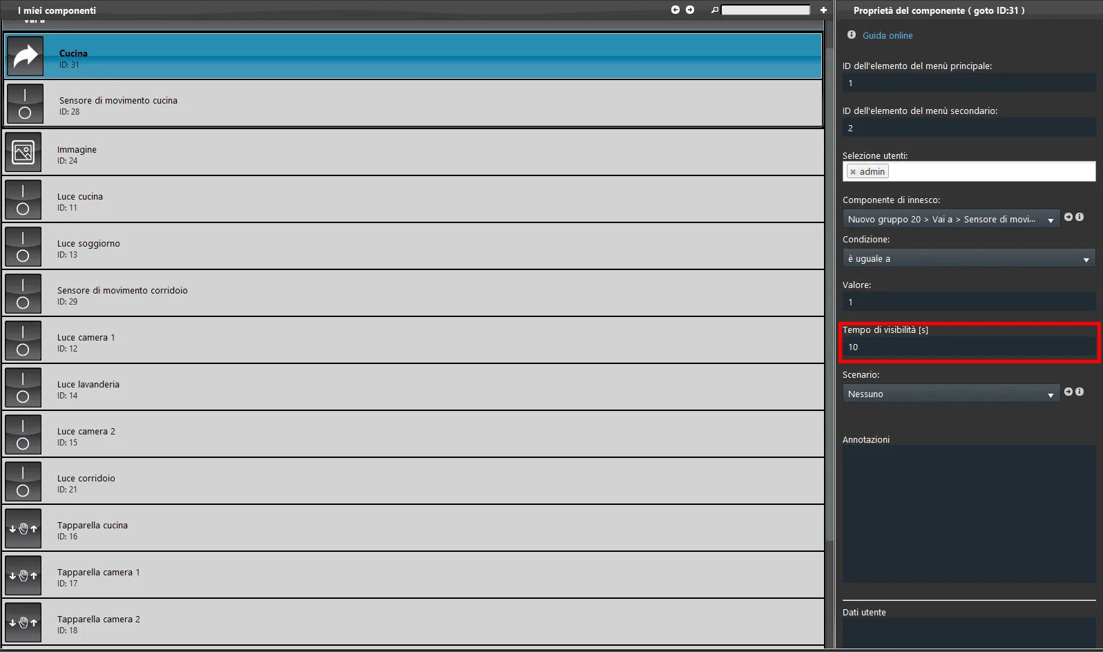
Step 4:
Add the Switch component to the user interface: it is required so that the Go to component can be started. Finally upload the project to the server.
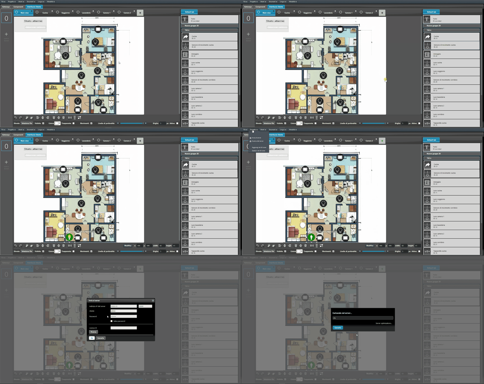
Configuration result in the user interface
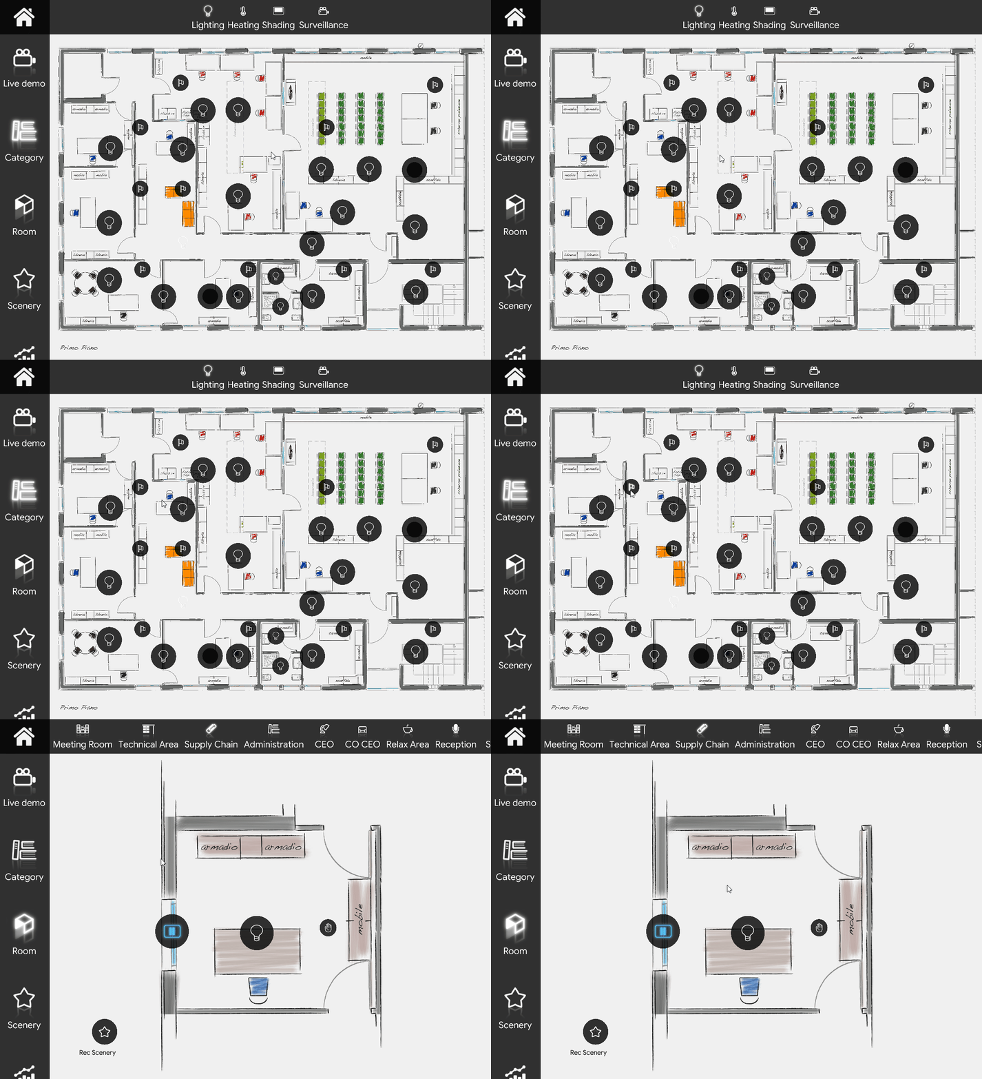
Below is the visual result of configuring the Go to component in the map-based interface. In this example, when the alarm is enabled and the motion sensor placed in the kitchen (in the center of the image) is triggered, the interface switches to the menu specified in the Go to component properties.
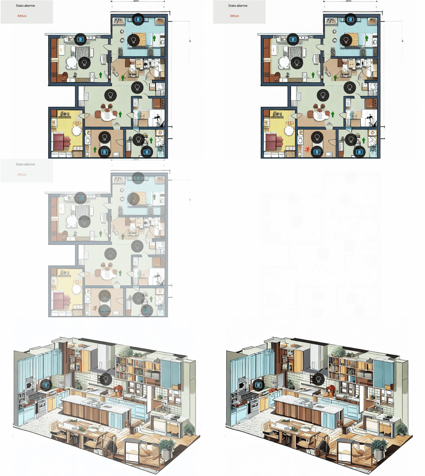
Download the Go to component test project.