Button
How the Button component works in Ilevia Manager and how it appears in the Ilevia Control app.
INTRODUCTION
The Button component sends an On/Off pulse to the actuator: the component state is reset every time it is pressed.
USE CASES
The Button component can be used as a trigger component for a scenario.
The Button component can be used as a switch to open a gate.
COMPONENT PROPERTIES
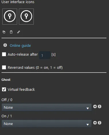
Automatic release: if selected, allows you to change the number of seconds;
After (…) seconds: Defines the number of seconds before the component returns to 0;
Inverse value: inverts the value, i.e. 0 = On and 1 = Off.
VIRTUAL
Virtual feedback: when enabled, simulates a feedback signal.
Off/0: connects a Scenario component that will be executed every time the Button changes to value 0.
On/1: connects a Scenario component that will be executed every time the Button changes to value 1.
KNX
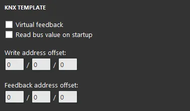
This component has been configured with the KNX gateway.
You can refer to the "Gateway / protocols" guide for more information.
Virtual feedback: refer to the "KNX protocol" guide;
Read bus value on startup: refer to the "KNX protocol" guide;
Write / Feedback address: refer to the "KNX protocol" guide.
Three display modes are available: "CLASSIC", "MODAL" and "HIDDEN". Click the link to learn more about the display mode.
CLASSIC VIEW
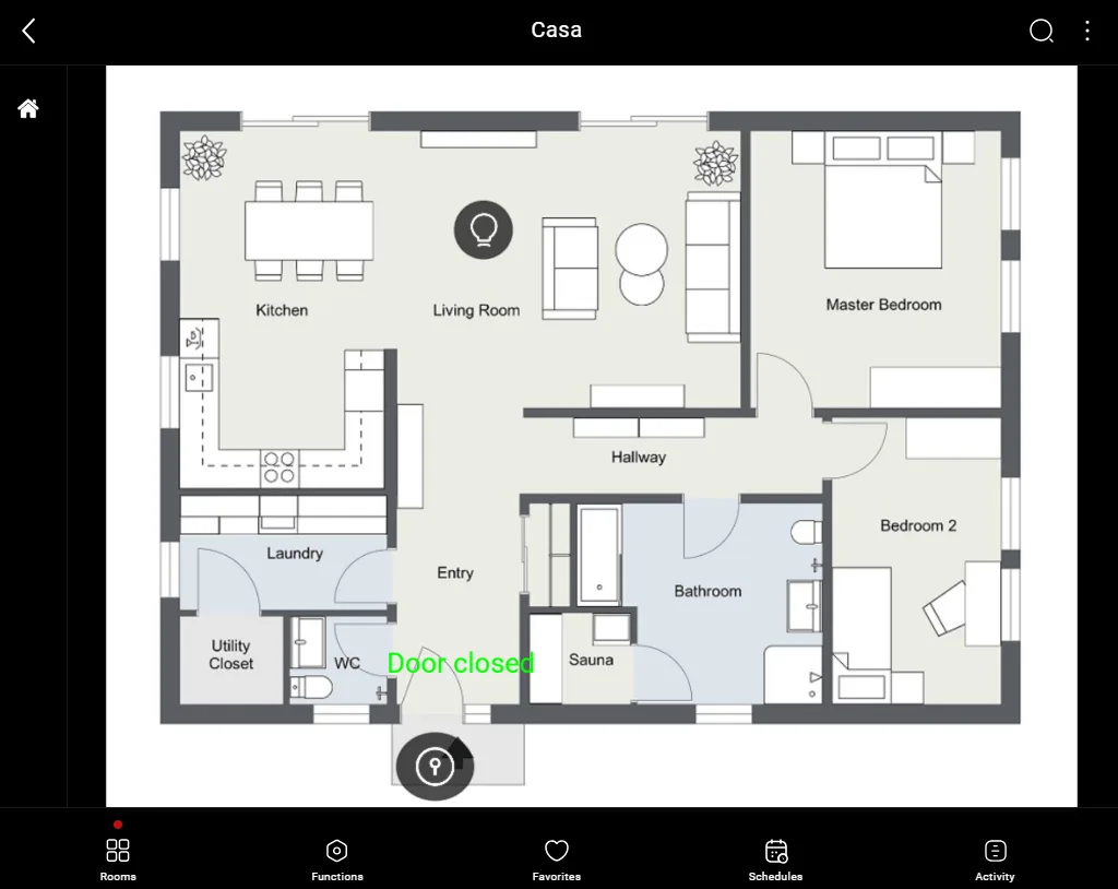
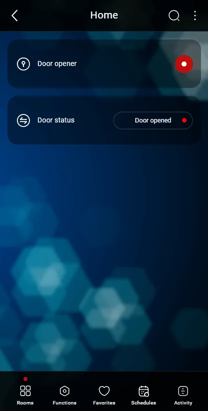
This is one possible result of the component in the Ilevia Control app (classic mode).
Doors, Gates, etc. ⇒ Button Icon

State 0 (white circle), Figure 1

State 1 (blue circle), Figure 2
The Button transitions from value 0 to value 1 and back to 0.
The time to return to value 0 is set in the component parameters.
Figure 1
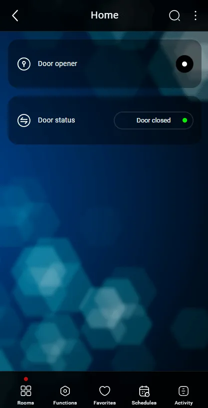
Figure 2
MAP VIEW
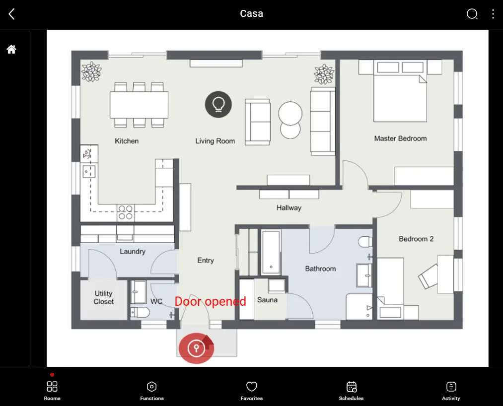
This is one possible result of the component in the Ilevia Control app (map mode).
The icons can be customized to suit your needs, from the symbol to the color.
In this case, we see the default icon:
Doors, Gates, etc. ⇒ Button Icon


State 0 and 1 (customizable icon)
The Button transitions from value 0 to value 1 and back to 0.
The time to return to value 0 is set in the component parameters.