The map interface editor
How to build a map-based interface in Ilevia Manager for ILEVIA Control: Map user, pages, free positioning of components, background, grid, alignment, layers, context menu, and page and component options.
In the map-based interface, commands are not arranged in rows of icons, as in the Classic interface, but freely placed on a page: you can set a floor plan or photo as the background and position lights, shutters, and thermostats exactly where they are in the house. This page explains the map editor in Ilevia Manager.
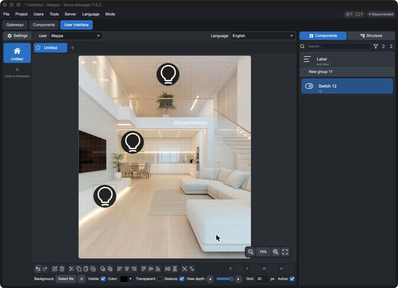
Do you already have the smartphone interface? You can start from that: with Users > Import interface from Manager creates pages and components with the same structure, and all you need to do is add the backgrounds and position the icons. See From the smartphone interface to the map interface.
Creating a map user
The interface type depends on the user. To create a map user:
Open Users > New user (or Users > Edit user for an existing user).
In User type, choose Map.
Enter the user name and password.
In Width and Height, specify the page size in pixels (1024 × 768 by default). Use the screen proportions on which the interface will be displayed.
Press Ok, then open the User Interface tab and select the user in User.
How the editor is structured
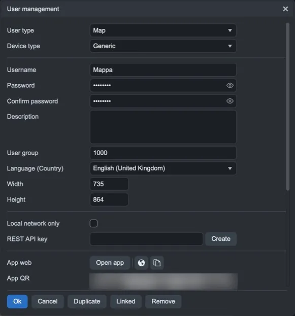
Left column: the interface main menu (icons or scenarios). Use + to add an item and choose its icon.
Top tabs: the pages of the selected item. The green + adds a page; the wheel next to the name opens the page options.
Central area: the page, with the grid. At the bottom right are the zoom controls: zoom out, current value (click for actual size), zoom in, fit to window.
Right panel: Components with the components to drag onto the page (and Label, a free text label); Structure with the tree of items, pages, and components.
Bottom bars: editing commands and page settings (see below).
Choosing the background
Each page can have a background image: a floor plan, a rendering, or a photo of the room. You then place the commands on top of it.
Select the menu item and the page.
In the bottom bar, next to Background, press Select file.
Choose the image on the computer and press Open. Manager copies it into the project, then it is uploaded to the server together with the rest using Project > Upload to server.
The image is fit to the page while keeping its proportions and is centered. Use the × next to Select file to remove it; use Visible to show or hide it; Color is the color that remains visible where the image does not cover the page.
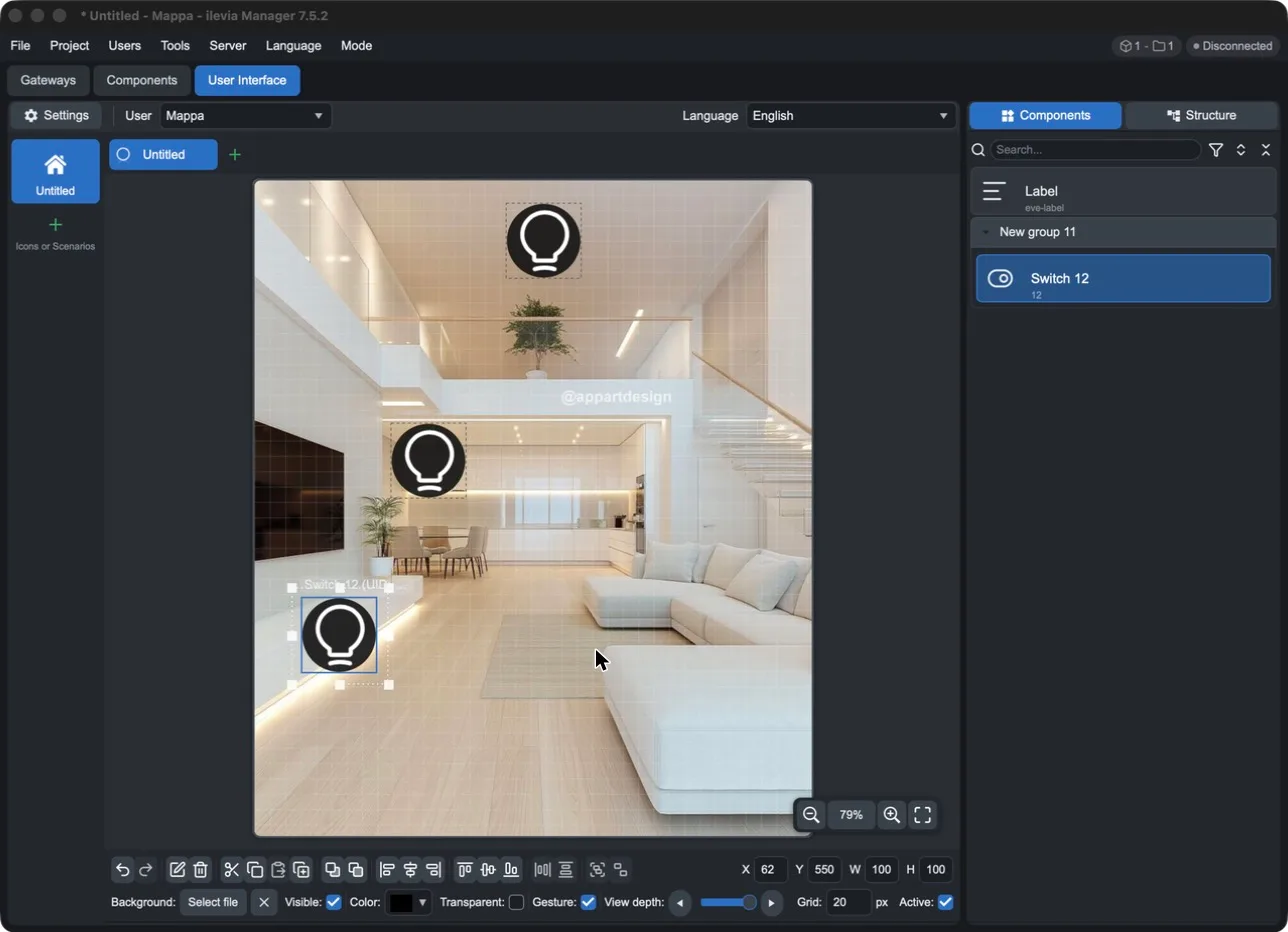
Use an image with the same proportions as the page. If the proportions are different, the image will not fill the page and bars of the background color will remain. The easiest way is to prepare the image already at the size specified in the user's Width and Height (in the example 735 × 864), or set Width and Height to match the image pixels.
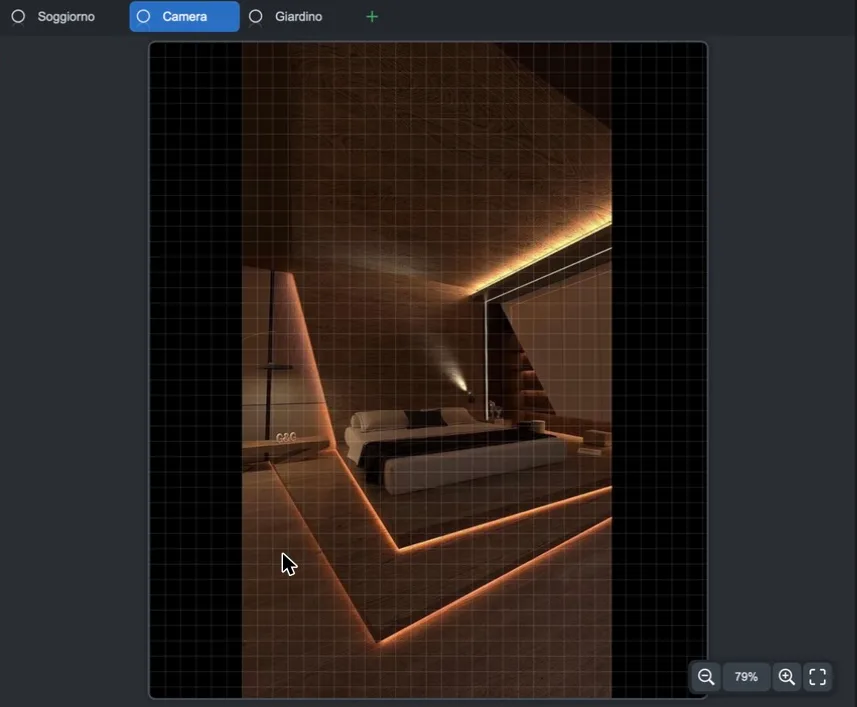
Positioning the components over the image
In the Components panel, drag the component onto the page, over the object it controls (the lamp, shutter, thermostat…).
Move it by dragging it; resize it using the handles at the corners and sides.
For an exact position, enter the coordinates in X, Y (top-left corner) and W, H (width and height) in the bottom bar. The values are in page pixels, that is, the user's Width × Height size.
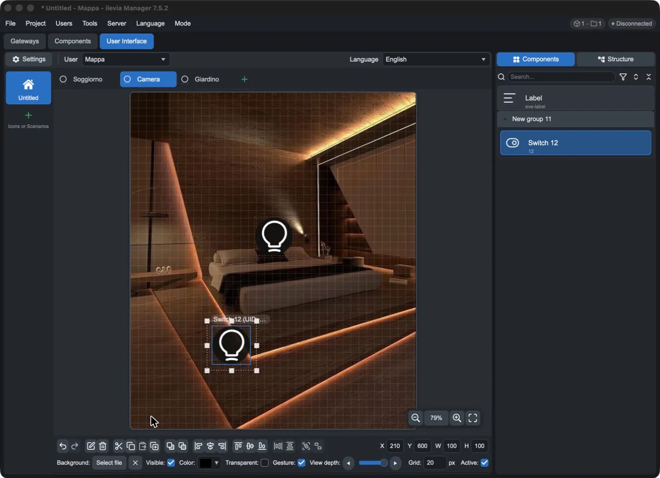
The same component can appear multiple times, even on different pages: for example, the same light on the floor plan and on the room photo.
Tips for a good result:
Work at actual size (Ctrl+1) to see how much space a command really occupies over the image.
Reduce the grid (for example Grid 5 px) or disable it with Active when you need to center a command on a small object; with Shift + arrows you move it one pixel at a time.
Reduce the size of the command with W and H or with Scale factor in the component options, so it does not cover the object in the photo.
Lock the position (Ctrl+L or Lock component from the context menu) when the command is in place, so you do not move it by mistake.
Do not change the page size afterward: positions are in pixels and do not follow the image. If you change the user's Width or Height, the commands stay where they were while the image is resized, and they must be repositioned.
To add text, drag Label onto the page and type the text in its options.
Selecting and moving
Click selects an item; Ctrl/Shift + click adds it to or removes it from the selection.
Dragging on an empty area selects all elements within the rectangle (hold Shift to add them).
Alt + click selects the element underneath the selected one, if they overlap.
Ctrl+A selects the whole page, Esc cancels the selection, Tab / Shift+Tab move to the next or previous element.
Arrow keys: move the selection by one grid step; Shift + arrows by one pixel.
The command bar

Command | Function | Key |
|---|---|---|
Undo / Redo | Cancels or repeats the last change. | Ctrl+Z / Ctrl+Y |
Edit | Opens the options of the selected elements. | Enter |
Remove | Deletes the selected elements. | Del |
Cut / Copy / Paste | Cut, copy, paste. | Ctrl+X / Ctrl+C / Ctrl+V |
Duplicate | Duplicates the selected elements. | Ctrl+D |
Move back / Move front | Sends the element behind or in front of the other elements. | — |
Align left / center / right | Aligns the selected elements horizontally. | — |
Align top / middle / bottom | Aligns the selected elements vertically. | — |
Distribute evenly | Distributes the elements at equal intervals, horizontally or vertically. | — |
Group / Ungroup | Groups the elements so they can be moved together, or separates them. | Ctrl+G / Ctrl+Shift+G |
X, Y, W, H | Position and size of the selection. | — |
Other keys: Ctrl+L locks or unlocks the position, Ctrl+K keeps proportions while resizing, Ctrl + mouse wheel or Ctrl + +/− zoom, Ctrl+0 fits the page to the window, Ctrl+1 shows it at actual size, Space + drag (or middle button, or Shift + mouse wheel) moves the view.
Page settings
The second bar applies to the open page:
Setting | Function |
|---|---|
Background · Select file | Selects the background image (for example, the floor plan). |
Visible | Shows or hides the background image. |
Color | Page background color. |
Transparent | Transparent background. |
Gesture | Enables or disables app gestures on this page. |
View depth | In the editor, shows only the elements up to the selected level: useful when many elements overlap. |
Grid … px | Grid step, also used for arrow-key movements. |
Active | Enables or disables the grid in the editor. |
The context menu
Right-clicking an element with the right mouse button opens a menu with additional functions.
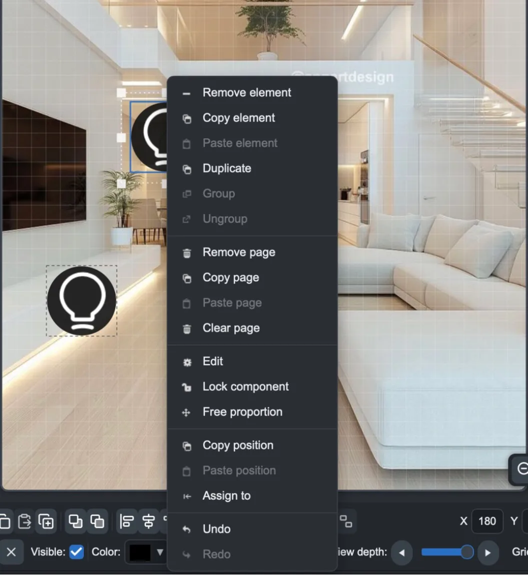
Item | Function |
|---|---|
Remove / Copy / Paste element | Deletes, copies, or pastes the element. |
Duplicate | Duplicates the element. |
Group / Ungroup | Groups or separates the selected elements. |
Remove page | Deletes the page. |
Copy page / Paste page | Copies all elements on the page and pastes them into another one, with the same positions and sizes. |
Clear page | Removes all elements from the page. |
Edit | Opens the element options. |
Lock component | Locks the element position: it will not move until you unlock it. |
Free proportion / Keep proportion | Free resizing or resizing with proportions locked. |
Copy position / Paste position | Copies an element's position and applies it to another one. |
Assign to | Links the element on the page to the component selected in the Components panel, replacing the current one. |
Undo / Redo | Cancels or repeats. |
For identical rooms: prepare a page, use Copy page and Paste page on the new page, then use Assign to to link each element to the correct component of the new room. Check the UID in the element options to verify the link.
Component options
Double-clicking a component (or Edit) opens Component options. At the top you find the group, name, and UID of the linked component.
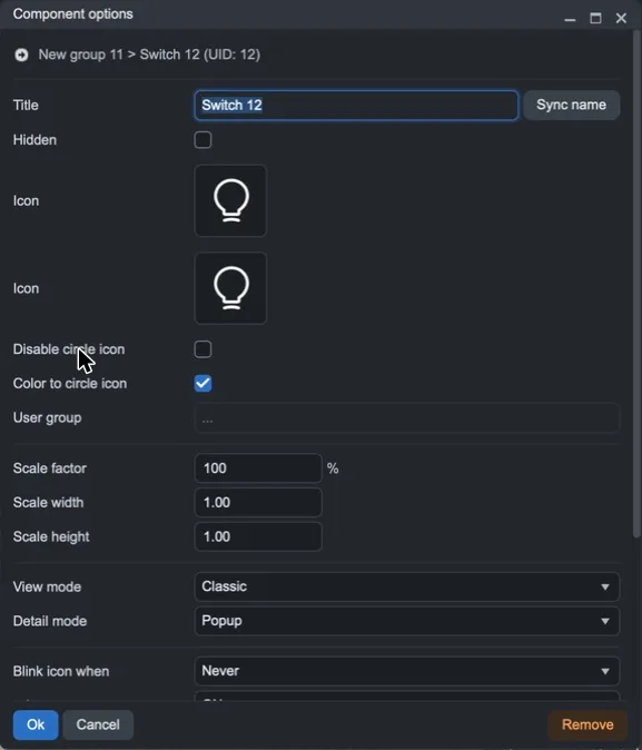
In addition to the Classic interface options (Title with Sync name, Hidden, User group, Blink / Hide / Disable icon when, Readonly), the map includes:
Option | Meaning |
|---|---|
Icon (two) | The icons for the two states of the component, for example off and on. |
Disable circle icon / Color to circle icon | Removes the circle around the icon or colors it according to the state. |
Scale factor | Component size as a percentage. |
Scale width / Scale height | Horizontal and vertical scaling, to distort the icon in only one direction. |
View mode | How the component appears on the page: for example Classic, text only, images only, or hidden. Available items depend on the component type. |
Detail mode | What opens when tapping the component in the app: Modal, Popup (small window), or Hidden (no window). |
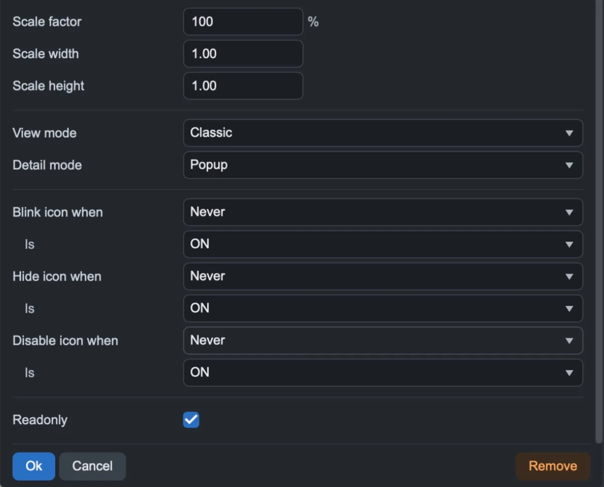
For examples of the modes, see Component display modes.
With View mode set to hidden, you can place an invisible component over an object in the background image: the user taps the object and controls the component.
Page options
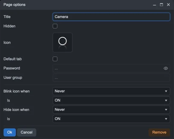
The wheel next to the page name (or a double-click on the tab) opens Page options.
Option | Meaning |
|---|---|
Title | The page name in the app. |
Hidden | Hides the page in the app. |
Icon | The page tab icon. |
Default tab | The page that opens first when the user selects the menu item. |
Password | Requests a password to open the page. |
User group | Restricts the page to the specified user groups. |
Blink / Hide icon when – Is | Makes the page icon blink or hides it based on the state of a component. |
The displayed items can change from page to page: for example, on the first page of the menu item, set as Default tab, Enabled appears instead of Hidden, and the icon conditions are missing.
Before uploading
Check the pages at actual size (Ctrl+1) to see how they will appear on the screen.
Use Structure to verify that each page contains the correct components and that nothing is hidden by mistake.
Upload the project with Project > Upload to server and test the interface in the app with the mapped user.