The smartphone interface editor
How to build in ilevia Manager the interface the user sees in the ILEVIA Control app: menu levels, adding icons and components, element options, structure, app settings, and keyboard shortcuts.
In the User Interface tab of ilevia Manager, build what the user sees in the ILEVIA Control app on the smartphone: the menus with room icons and, inside them, the component commands. Each project user has their own interface. This page describes the Classic interface editor, the one suggested for every new user.
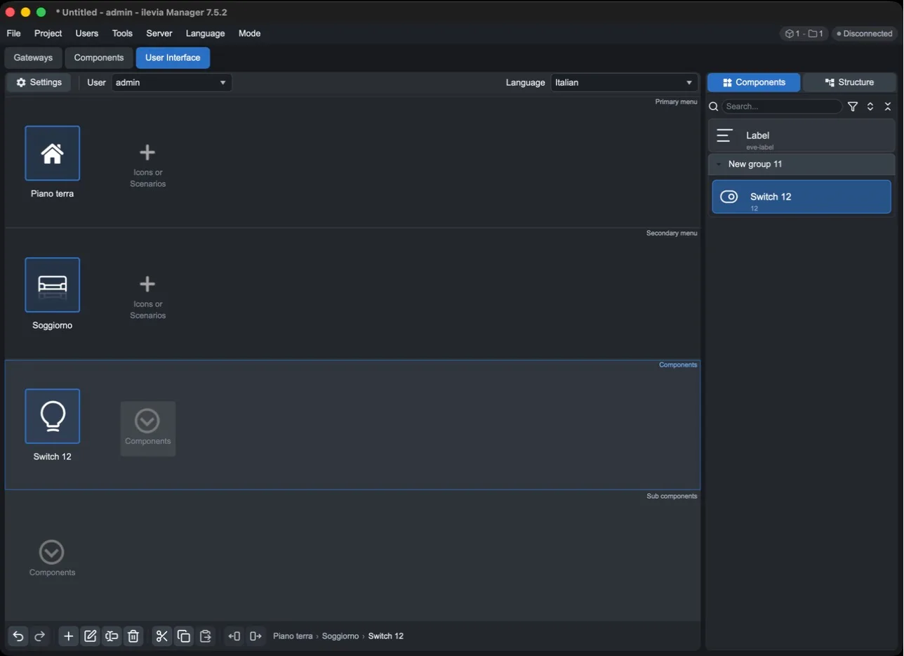
How the editor is structured
Top bar: Settings opens the app settings for the user, User selects the user you are working on, Language the title language.
Central area: the four interface levels, from top to bottom.
Right panel: Components lists the project components to insert; Structure shows the full interface tree.
Bottom bar: editing commands and the path of the selected element (for example Ground floor > Living room > Switch 12).
The four levels
Level | What it contains | In the app |
|---|---|---|
Primary menu | Icons or scenarios. This is the starting point: usually the floors or areas of the house. | The main menu. |
Secondary menu | Icons or scenarios inside the selected Primary menu item, for example the rooms. Optional. | The second navigation level. |
Components | The components (or scenarios) of the selected item: lights, shutters, thermostats… | The room commands. |
Sub components | Components inside the selected component. Optional. | An additional command level. |
Each level shows the content of the item selected in the level above: when you select another Primary menu item, the levels below change.
Building the interface
1. Add the menu items
Select the Primary menu level and press + Icons or Scenarios (or Add in the bottom bar).
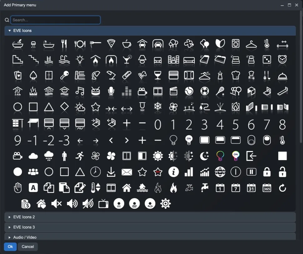
In the Add Primary menu window, choose an icon. Icons are grouped into sets (EVE Icons, EVE Icons 2, EVE Icons 3, Audio / Video…) and there is a search field at the top.
Press Ok. The item is created with the name Untitled.
Press F2 (or Rename) and enter the name, for example “Ground floor”.
Repeat in the Secondary menu for the rooms, for example “Living room”.
2. Insert the components
Select the room in the Secondary menu.
In the right panel, open Components.
Drag the component into the Components level.
The component appears with the icon and title defined in its properties. The same component can appear in multiple rooms or for multiple users.
3. Check the structure
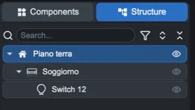
The Structure panel shows the entire interface as a tree. From here you can find an item with search, expand or collapse branches, and with the icons next to each item, show or hide it, hide it in the app, or set it as the default tab.
Menu item options
Double-click a Primary or Secondary menu item (or select it and press Edit) to open its options.
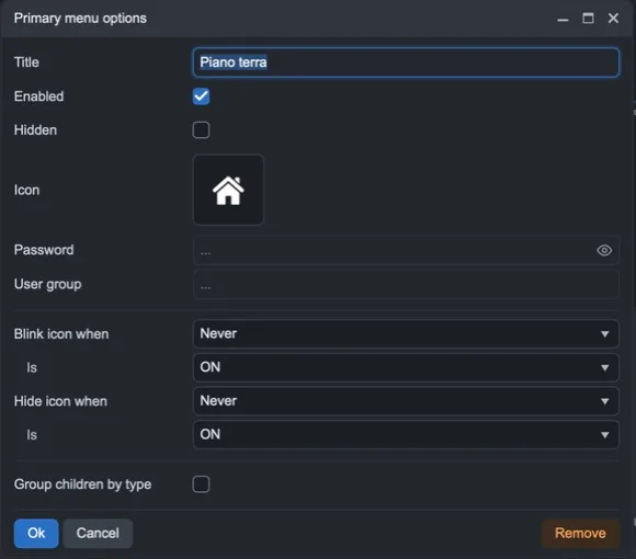
Option | Meaning |
|---|---|
Title | The name shown in the app. |
Enabled | If disabled, the item is not active. |
Hidden | Hides the item in the app. |
Icon | The icon: click to change it. |
Password | Asks for a password to open the item in the app. |
User group | Restricts the item to the specified user groups. |
Blink icon when / Is | Makes the icon blink when a component has a certain state (for example an alarm ON). |
Hide icon when / Is | Hides the icon when a component has a certain state. |
Group children by type | Groups the item contents by component type. |
Remove | Deletes the item. |
Component options
Select a component in the interface and press Enter (or Edit) to open Component options. At the top you find the component group, name, and UID: the arrow selects it in the Components tab.
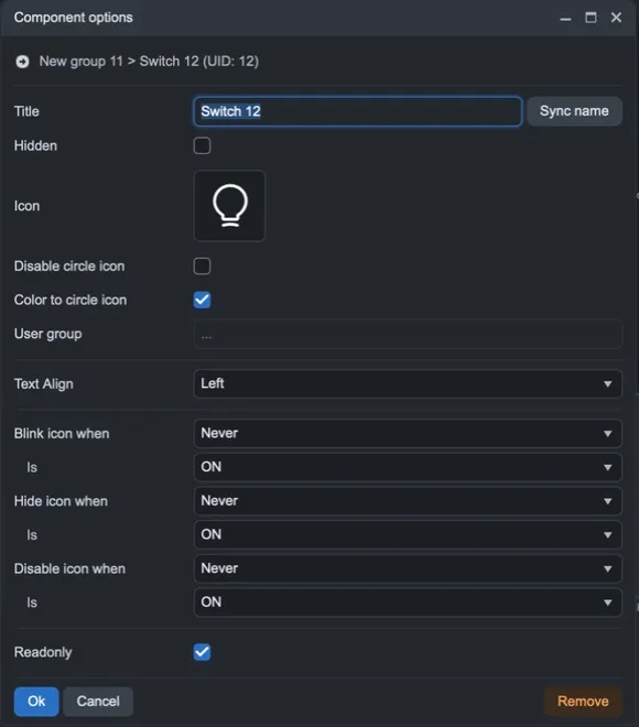
Option | Meaning |
|---|---|
Title | The name in the app. If you change it here, it applies only to this interface position; Sync name restores the component name. |
Hidden | Hides the component in the app. |
Icon | The component icon in this position. |
Disable circle icon / Color to circle icon | Removes the circle around the icon or colors it according to the state. |
User group | Restricts the component to the specified user groups. |
Text Align | Text alignment. |
Blink / Hide / Disable icon when – Is | Makes the icon blink, hides it, or disables it when a component has a certain state. |
Readonly | The component is visible but cannot be controlled from the app. For more complex components (dimmers, thermostats) there are separate options for each part. |
Remove | Removes the component from this interface position (not from the project). |
Changes to title and icon made in the interface do not affect the component in the Components tab.
App settings (Settings)
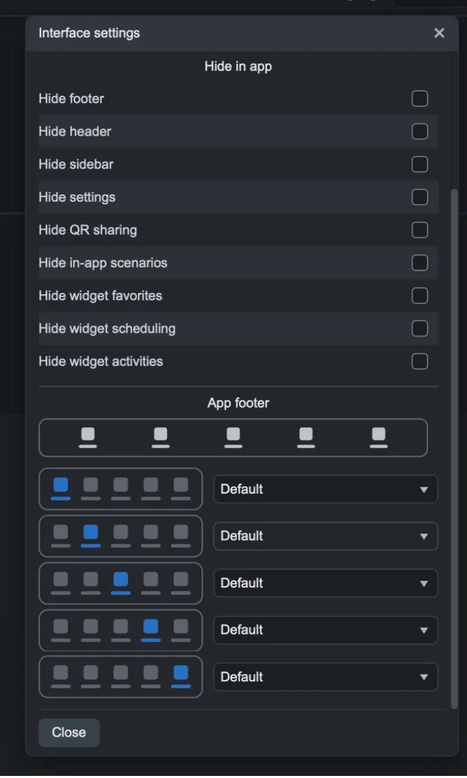
Settings opens the selected user's Interface settings: choose which app functions to show or hide.
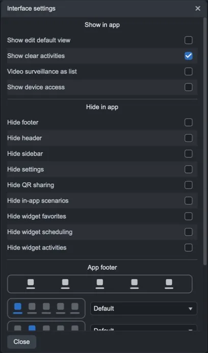
Section | Options |
|---|---|
Show in app | Show edit default view, Show clear activities, Video surveillance as list, Show device access. |
Hide in app | Hide footer, Hide header, Hide sidebar, Hide settings, Hide QR sharing, Hide in-app scenarios, Hide widget favorites, Hide widget scheduling, Hide widget activities. |
App footer | The contents of the five buttons in the app’s bottom bar. For each position, choose: Default, Empty, Hidden, Ambients, Functions, Favorites, Schedules, Activities, Devices, Scenarios, Multimedia, Energy, Charts, and other items. |
The command bar
Button | Function | Key |
|---|---|---|
Undo / Redo | Undoes or redoes the last change. | Ctrl+Z / Ctrl+Y |
Add | Adds an item to the selected level. | — |
Edit | Opens the options for the selected item. | Enter, Ctrl+E |
Rename | Renames the selected item. | F2 |
Remove | Deletes the selected item. | Del |
Cut / Copy / Paste | Cuts, copies, and pastes the selected item; the pasted item is placed after the selected one. | Ctrl+X / Ctrl+C / Ctrl+V |
Move left / Move right | Moves the item left or right within its level. | Ctrl+← / Ctrl+→ |
Other useful shortcuts:
Ctrl/Shift + click or Shift + arrows: select multiple items in the same row; Ctrl+A selects them all, Esc clears the selection.
With multiple items selected, Enter edits them together and dragging moves them all.
In option windows, Enter confirms and Esc closes without saving.
Ctrl+↑ / Ctrl+↓: select the previous or next component in the component list.
Users and languages
The interface is different for each user: choose the user from the User menu at the top. To create a user or change its interface type (Classic or Map-based), use the Users menu in Manager; to copy an interface from another user, use Users > Import interface from.
With Language, choose the language in which you write titles: you can translate each title into the app’s languages. Titles that have not yet been translated are flagged.
For the map-based interface, see User interface: classic and map-based editor.
Try the interface
Save the project and upload it to the server with Project > Upload to server, then open the ILEVIA Control app with the configured user. To test it without affecting a running system, you can use Users > Test mode.