
Components and gateways: the basic concepts of Ilevia Manager
What gateways and components are in Ilevia Manager, how they are connected, and what properties all components have in common.
An Ilevia Manager project is built with two elements: gateways, which tell the Ilevia server how to communicate with the systems, and components, which represent what to control or read (a light, a blind, a temperature, a scenario). This page explains the two concepts and the properties common to all components.
Gateway
A gateway is a communication configuration: it tells the server which protocol to use (KNX, Modbus, Vimar By-me, BTicino, MQTT, HTTP…) and how to reach the system (IP address, port, interface, credentials). It does not necessarily correspond to a physical device: on the same server you can have multiple gateways, even of the same protocol.
Gateways are created in the Gateways tab with the + button. Each gateway appears as a card with name, protocol and ID.
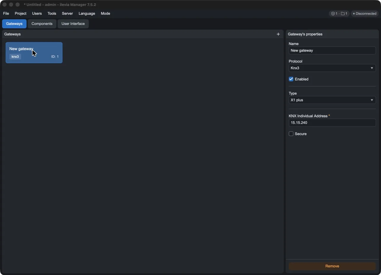
All gateways have these properties:
Property | Meaning |
|---|---|
Name | Gateway name, the one you will then see in the components (for example KNX system - Knx3). |
Protocol | Communication protocol. The specific parameters for that protocol are shown below. |
Enabled | If disabled, the server does not use the gateway and the connected components do not communicate. |
Remove | Deletes the gateway from the project. |
In addition to the gateways you create, each project includes some system gateways for components that do not depend on an external system: for example Virtual (values managed only by the server), Graphic UI - Gui (interface components and services such as voice control), Multimedia - Video and Web - Url.
For the parameters of each protocol, see the gateway overview and the guide Adding and removing a gateway.
Components
A component is a project object with a value: the state of a switch, the position of a blind, a temperature, the text of an information item. The server keeps the value updated, the ILEVIA Control app displays and controls it, and logic, scenarios and schedules use it.
Each component is linked to a gateway: the gateway translates the value into the system protocol. For example, a Switch connected to a Knx3 gateway sends and receives KNX telegrams with DPT 1.001; the same Switch connected to a Modbus gateway reads and writes a register.
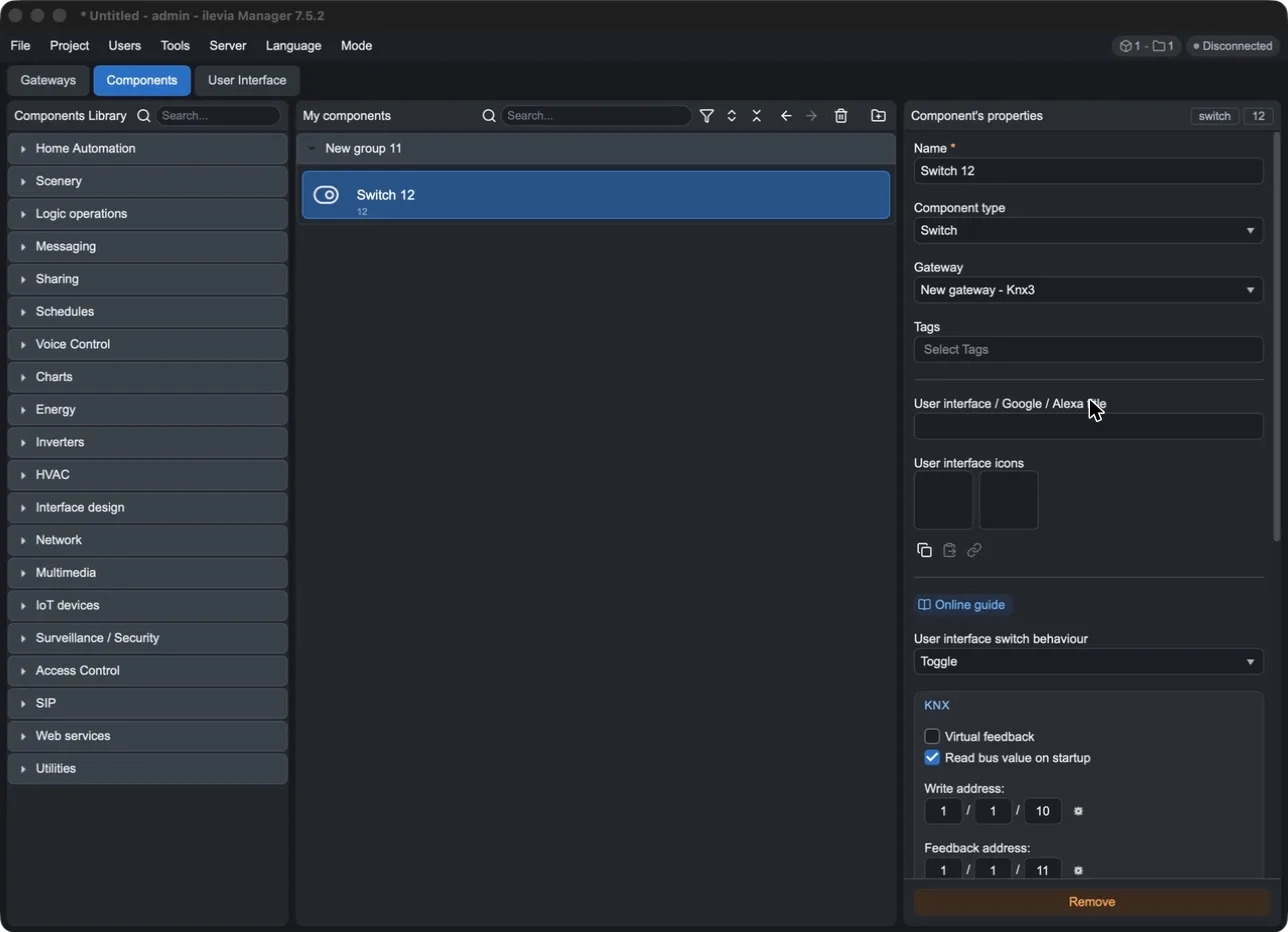
The Components tab is divided into three columns:
Components Library: all component types, grouped by category (Home Automation, Scenery, Logic operations, Schedules, Voice Control, Charts, Energy, HVAC, Multimedia, IoT devices, Surveillance / Security, Access Control, Web services, Utilities…). The search field at the top finds a type by name.
My components: the components in the project. To add one, drag it from the library. You can organize them into groups.
Component's properties: properties of the selected component. At the top right you find the type (for example switch) and the component ID.
The My components bar
Button | Function |
|---|---|
Magnifying glass | Search for a component by name. |
Funnel | Filter the list. |
Up/down arrows | Expand or collapse all groups. |
Back / forward arrow | Go back to the previously selected component or to the next one. |
Trash bin | Delete the selected components. |
Folder with + | Create a new group. |
The component ID
Each component has an ID: an integer number that uniquely identifies it in the project. You can find it in three places:
in My components, under the component name (for example Switch 12 has ID 12);
at the top right in the properties, next to the type (for example switch 12);
in the component options in the User Interface tab, as UID.
ID rules:
Rule | Meaning |
|---|---|
Assigned by Manager | When you add a component, Manager assigns it the next number after the highest one already present in the project. It is neither chosen nor editable. |
Unique in the project | Two components in the same project never have the same ID. My components groups also take a number from the same sequence (for example New group 11 and then Switch 12). |
Stable | Changing the name, title, icons, gateway or parameters does not change the ID. Component type also keeps the ID: the component changes type but remains the same. |
New for copies | A copied or duplicated component is a new component and gets a new ID. |
Separate from gateways | Gateways have their own numbering (the ID in the gateway tab): gateway ID 1 and component ID 1 are different things. |
The name is for people, the ID is for the system. All links between components use the ID: the app interface, Copy value to, logic and scenarios, scripts, the Voice Control Manager and HomeKit. This is why you can rename a component without breaking any links.
If you delete a component and create an identical new one, the new one has a different ID: the links to the old one (interface, logic, scripts, voice assistants) do not automatically transfer to the new one and must be recreated. To replace a component, if possible modify it instead of deleting it.
When you request support, provide the component ID as well as the name: names can repeat, IDs cannot.
Common properties for all components
Properties vary depending on the component type and gateway, but some parts are always present.
At the top
Property | Meaning |
|---|---|
Name | Component name in the project (required). |
Component type | For some types, converts the component to a similar type (for example, a Switch to Lock or Pulse, an Info to Set point). |
Gateway | The gateway through which the component communicates. Changing it also changes the protocol parameters below. |
Tags | Labels used to group components: there are ready-made labels (Light, Sockets, Motorizations, Temperature, Scenarios, Security, Energy…) and you can create new ones by typing the name and pressing Enter. Some labels enable functions, for example Show in recorder webpage. |
User interface / Google / Alexa title | The name shown in the ILEVIA Control app and used by voice assistants. |
User interface icons | The component icons in the interface (for two-state components, one for the off state and one for the on state). |
Online guide | Opens the online guide for the component. |
Below the icons there are three buttons:
Copy icons: copies the component icons.
Paste icons: pastes the copied icons.
Paste as link: pastes the icons as a link: the component will always use the icons from the source component, even if they change later. The link can be removed with Remove link.
In the center: type and protocol parameters
Below the common properties are the parameters specific to the component type (for example, the button behavior of a Switch) and, in a box with the protocol name, the parameters of the selected gateway: group addresses for KNX, registers for Modbus, topics for MQTT, and so on. For a complete example see Switch component with Knx3 gateway.
At the bottom
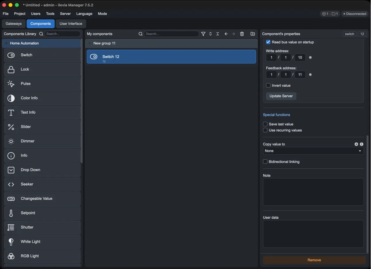
Properties | Meaning |
|---|---|
Save last value | The server stores the last value and restores it after a restart. |
Use recurring values | The server also processes values that are the same as the previous one instead of ignoring them. |
Copy value to | When the value changes, it is copied to the selected component. The arrow next to it selects that component. |
Bidirectional linking | The copy works in both directions. |
Note | Free-form notes for the person configuring the system. |
User data | Free field for custom component data. |
Remove | Deletes the component from the project. |
The special functions and Copy value to appear only in the component types that support them.
From components to the interface
Components do not appear in the app by themselves: in the User Interface tab, you arrange them in the pages and rooms that the user will see in ILEVIA Control. A component can have no graphical representation and be used only for logic and scenarios.
When the project is ready, upload it to the server with Project > Upload to server: gateways, components, and interface become active.