Text Info
How to configure the Text Info component in Ilevia Manager, which shows different texts and colors in the user interface based on the On/Off state.
Introduction
It lets you view different texts and colors in the user interface based on the On / Off state.
Use cases
You can use the Text Info component to create custom text feedback to link to a component (switches, sensors, etc.).
Component properties
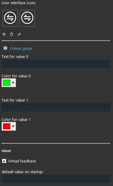
Text:
When the value is 0: enter the text that will be shown in the user interface when the value is 0;
When the value is 1: enter the text that will be shown in the user interface when the value is 1;
Color:
When the value is 0: choose the text color when the value is 0 (right-click in the box);
When the value is 1: choose the text color when the value is 1 (right-click in the box).
Default value on startup: here you can set the default value on server startup.
KNX
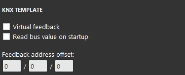
This component is implemented using the KNX gateway.
You can refer to the chapter “Gateway / Protocols” for more information.
Virtual Feedback (checkbox): refer to the chapter “KNX Gateway”;
Read bus value on startup (checkbox): refer to the chapter “KNX Gateway”;
Write / Feedback address
There are three possible display modes: “CLASSIC”, “MODAL” and “HIDDEN”. For more information, see the “Common properties” guide.
Classic user interface
Here is the result of the component in the Ilevia Control interface (Classic style).
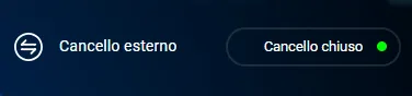
Text info On state (Figure 1)

Text info Off state (Figure 2)
Figure 1
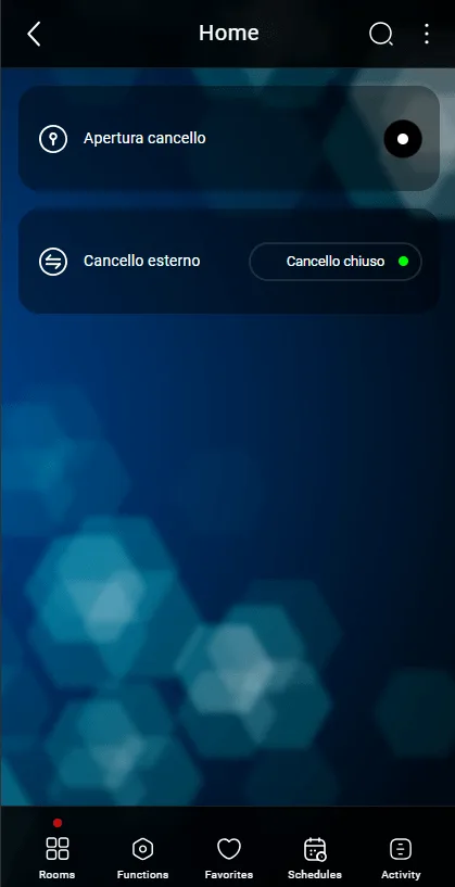
Figure 2
Map user interface
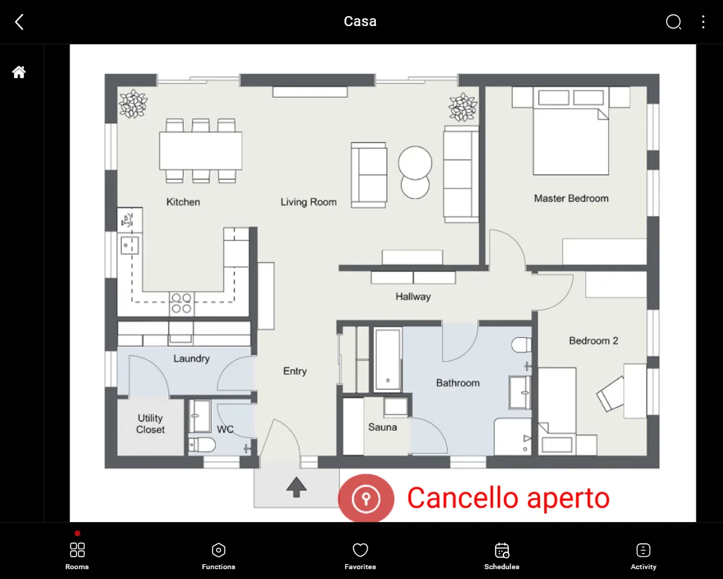
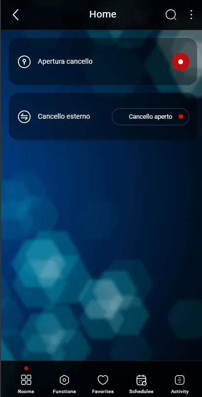
Here is an example of a possible visual result of the Text Info component in the Map user interface of the Ilevia Control app (Map style).

Text info with state 0 (Figure 1)

Text info with state 1 (Figure 2)
Figure 1
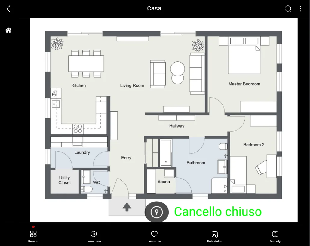
Figure 2