Slider
How to configure the Slider component in Ilevia Manager, which represents a percentage (dimmer, blind opening), and how it appears in Ilevia Control.
Introduction
The Slider component represents a percentage. The percentage of a dimmer is controlled by a Slider. If necessary, indicate a maximum value higher than 100; you can change the default settings.
It is also possible to split the percentage into several points and define which icon to use for each range.
Use cases
You can use the Slider component to set the brightness of dimmable lights, or to set the opening of blinds.
Component properties
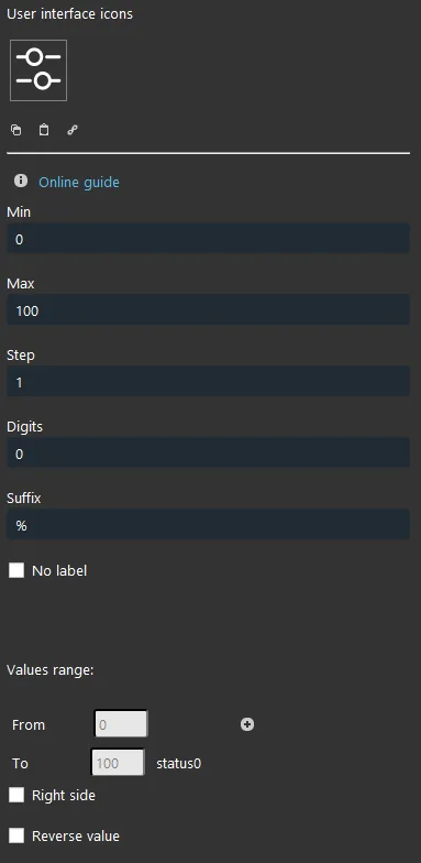
Min: minimum value, from 0 to 100;
Max: maximum value from 0 to 100;
Step: the step value from the previous change to the next one;
Decimals: how many decimal places are displayed after the comma;
Suffix: the unit of measure applied to the represented data;
No label: allows you to hide the component label in the user interface;
Value range:
From: lowest value that can be represented in the user interface;
To: highest value that can be displayed in the user interface;
You can add a new range: select the “+” icon and a new icon will be created to identify the new range.
KNX
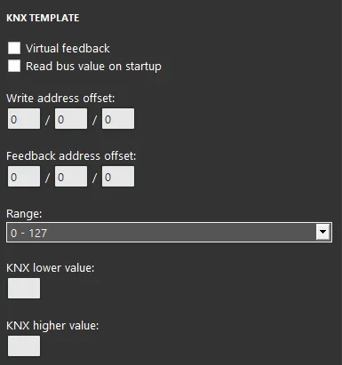
This component has been configured with the KNX gateway.
You can refer to the “Gateway / Protocols” guide for more information.
Virtual Feedback: refer to the “KNX protocol“ guide;
Read bus value on startup: refer to the “KNX protocol“ guide;
Write / Feedback address: refer to the “KNX protocol“ guide;
Range: depends on the object set in the ETS database of the KNX module.
There are three possible display modes: “CLASSIC”, “MODAL” and “HIDDEN”. For more information, refer to the Common properties guide.
Classic view
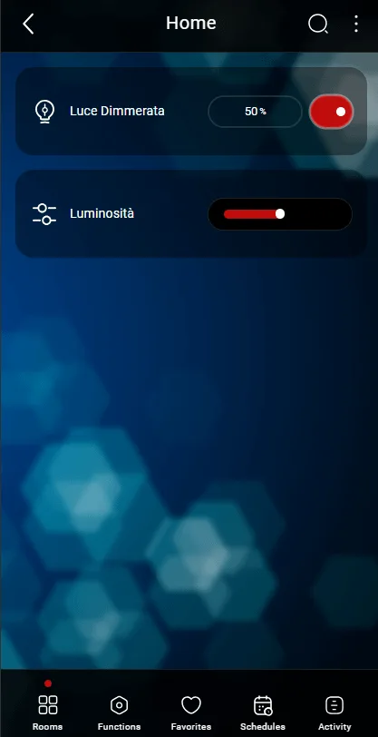
This is the component result inside Ilevia Control (Classic style).
Sliders are shown as scroll bars that light up along the path.

Scroll bar 0% (slider mask)

Scroll bar 50% (slider mask)
Figure 1
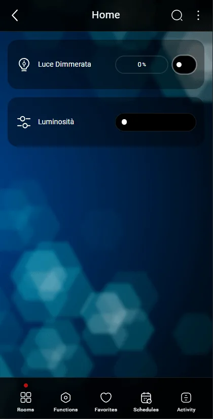
Figure 2
Map view
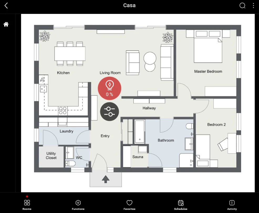
This is just one possible result of the component in Ilevia Control (Map style).
The icons can be customized as needed: symbol, color, and size.
In this case, we used the default icons:

Scroll bar Figure 2
Figure 1
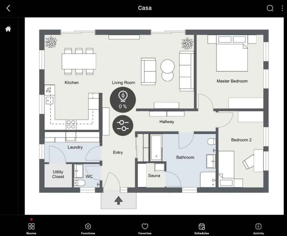
Figure 2