
Classic user interface
4-level structure of the classic user interface of Ilevia Control, management of scenarios and customization of icons, colors and texts.
Introduction
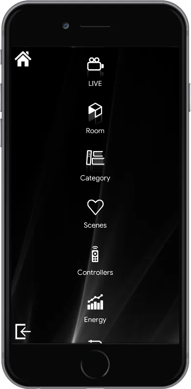
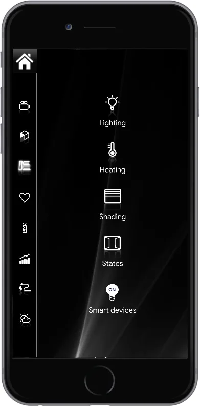
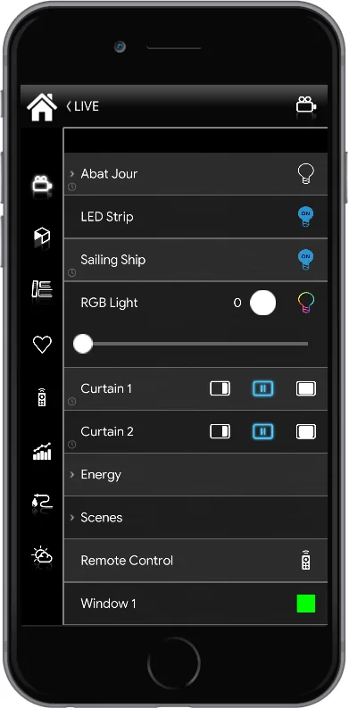
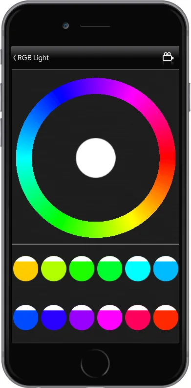
A “Classic” interface consists of 4 menus (from top to bottom). This page describes what each level can contain and how to customize its icons.
Main menu: only icons (from the Icons section) or scenarios (from the Components section). It is the starting point of the entire structure;
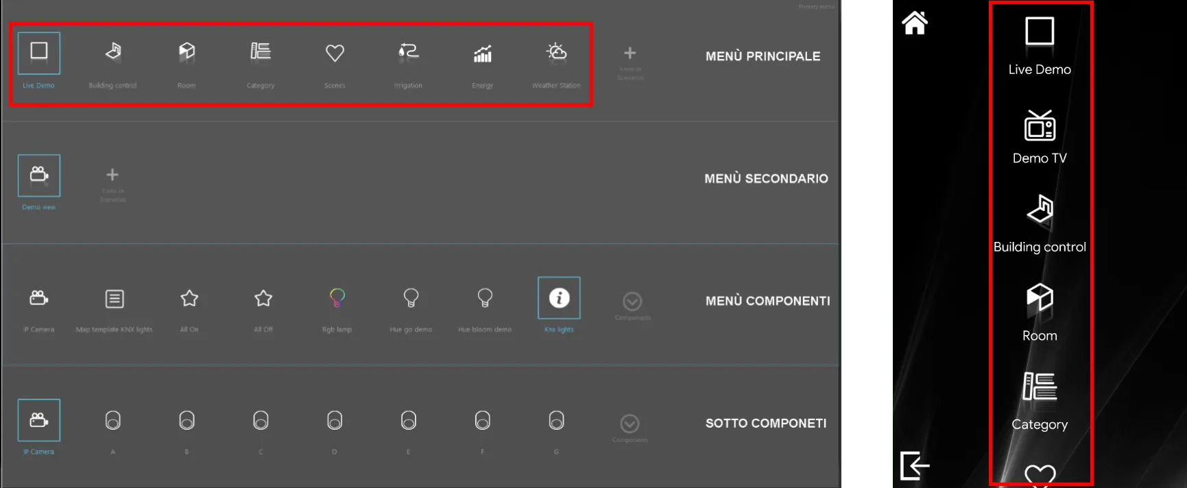
Submenu: only icons (from the Icons section) or scenarios (from the Components section). This menu is optional;
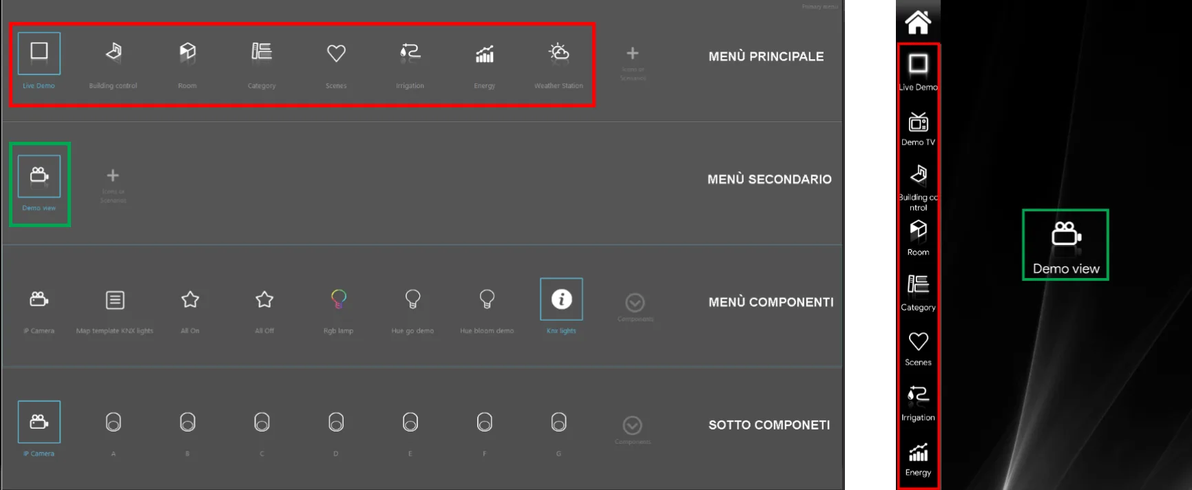
Components: only components or scenarios (from the Components section);
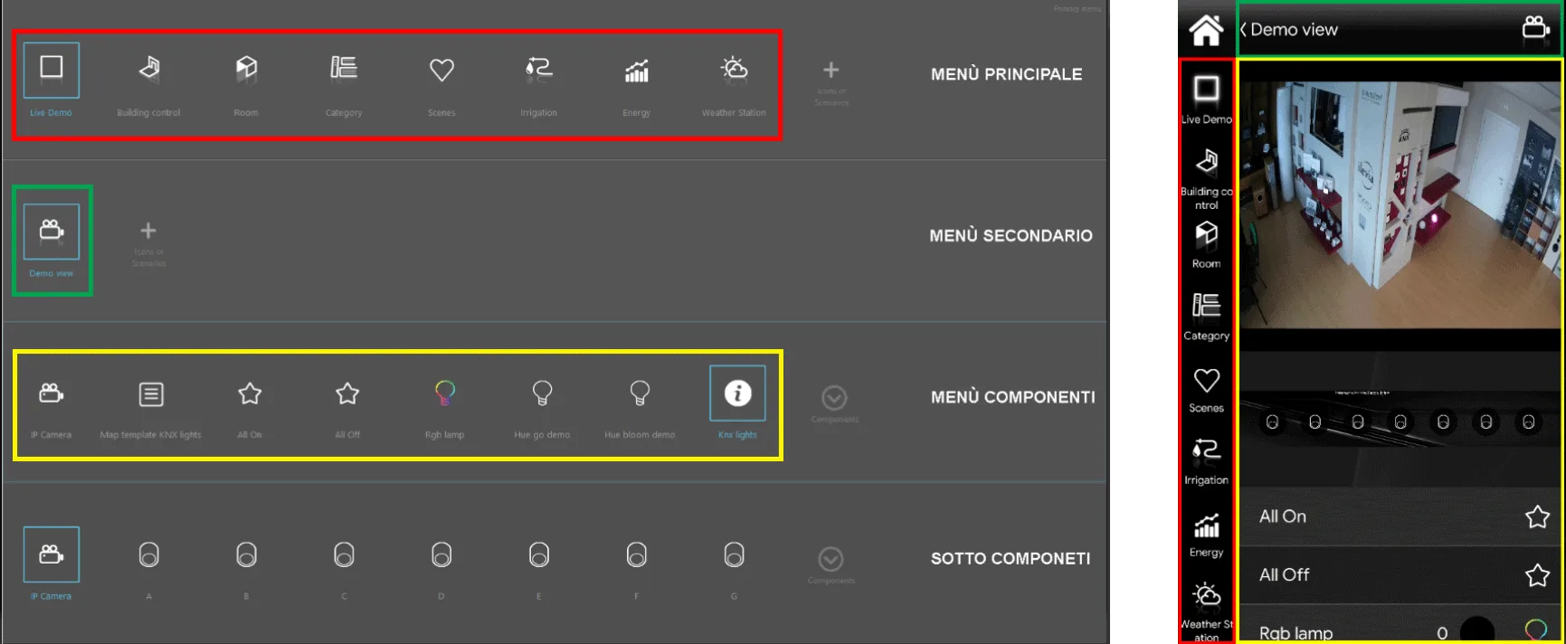
Subcomponents: only components and scenarios (from the Components section). This menu is optional.
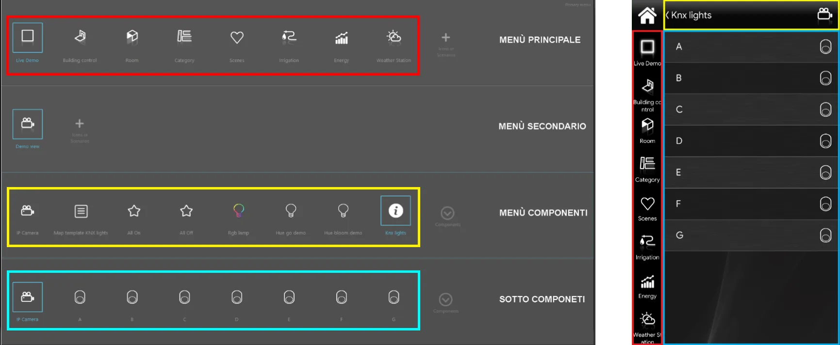
Final result
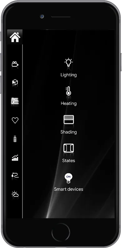
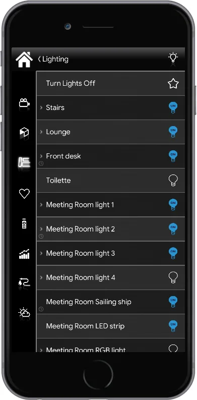
The images below show the result of the configuration in the interface editor.
From left to right, an overview of all levels is shown, from the first to the last.
The first and second levels are used for categorization; the third and fourth are dedicated to component control, each with its own command icon.
To see how each individual Ilevia Manager component appears in the interfaces, refer to the component library.
Scenario management
The Scenario component is an exception: it can be placed at any level, but the result is different. If the Scenario is placed in the first or second level, its icon can be customized; if it is placed in the third level, the icon is the default one (a star).
Customization
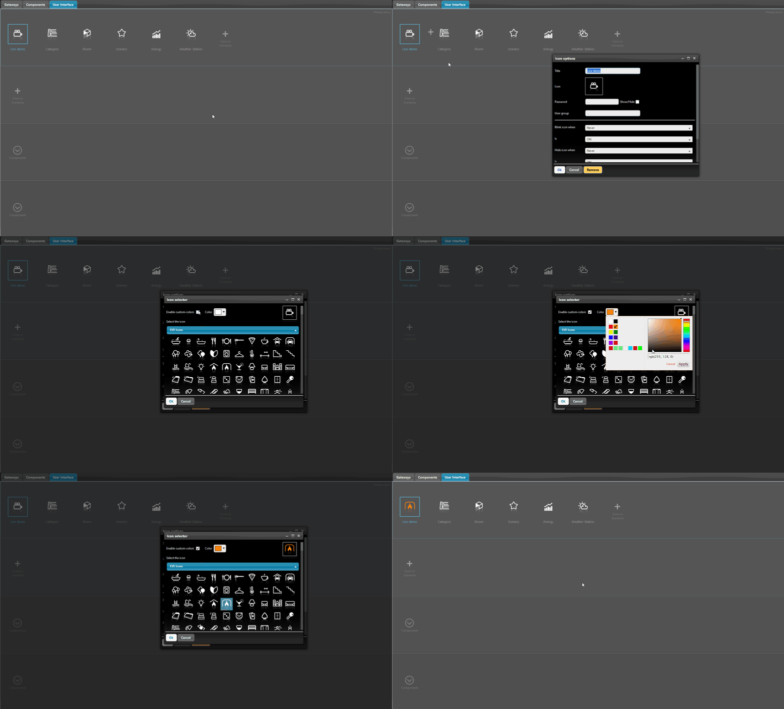
The Classic interface reduces choices in favor of better organization and easier navigation. However, it is still possible to customize the icon, color and text of each object: double-click the desired icon and the icon editor will open, where you can make changes.
Note. For a component, changes to name and icon made in the interface are not reflected in the Components section. For more information, see the guide to the common component properties.