
Icon editor
Description of the Ilevia Manager icon editor parameters for customizing the title, icon, color, and behavior of icons and components in the interface.
Introduction
The icon editor allows you to customize the title, icon, color, and behavior of icons and components in the user interface. The editor settings change depending on the object type (icon or component) and on the interface (classic or map-based).
Classic interface editor
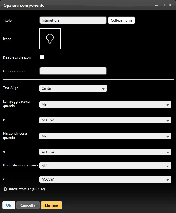
Editor
Title: title of the selected object, which can be changed as needed;
Link name: this button synchronizes the title of the component assigned in the Components tab with the one placed in the user interface;
Icon: icon defined for the selected object, which can be changed as needed;
Parameters available only for components:
View mode: we recommend consulting the guide “Component display mode”;
Disable icon circle: this checkbox disables the circle shown outside the component (only in Map display mode);
Hide icon when: condition that allows the component icon to be hidden or shown based on a specific condition;
Disable icon when: condition that allows the component icon to be disabled based on the state of a second component; when the condition occurs, the component icon cannot be clicked in the interface.
Map interface editor
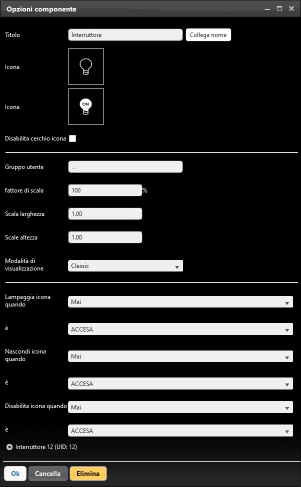
Editor
Title: title of the selected object, which can be changed as needed;
Link name: this button synchronizes the title of the component assigned in the Components tab with the one placed in the user interface;
Icon: icon defined for the selected object, which can be changed as needed;
Scale factor: percentage value that defines the icon size;
Width scale: scale value for the object width;
Height scale: scale value for the object height;
Parameters available only for components:
Display mode: we recommend consulting the guide Component display mode;
Flash icon when: condition that makes the icon flash based on the state of a second component;
Disable icon circle: this checkbox disables the circle shown outside the component;
Hide icon when: condition that allows the component icon to be hidden or shown based on a specific condition;
Disable icon when: condition that allows the component icon to be disabled based on the state of a second component; when the condition occurs, the component icon cannot be clicked in the interface.
Icon editor
This is the icon editor interface in the User Interface section. To edit an icon, right-click the icon: the editor will open, allowing you to apply changes.
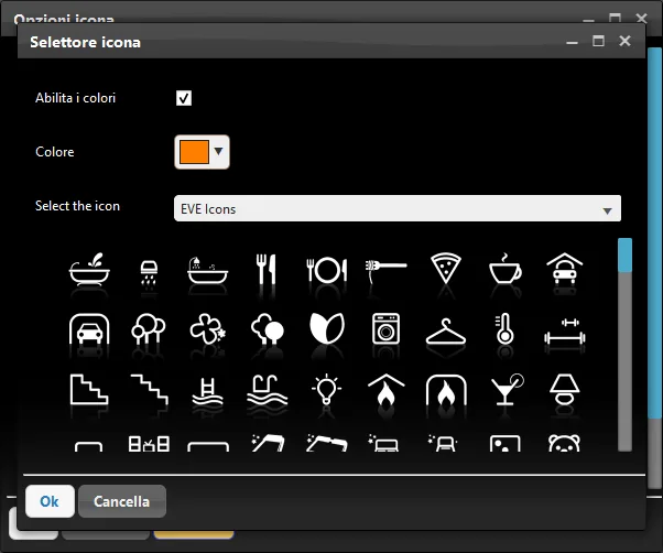
Icon editor
Enable colors: this checkbox allows you to set a different color for the selected icon;
Icon: defines the icon for the selected object;
Color: represents the color set for the selected icon.
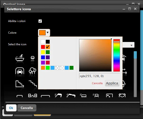
Color picker
Enabling color lets you change the icon color. Choose the color you prefer from the picker; you can also save your favorite colors on the right side of the screen.
Note. In the map-based interface, if the “circular icon” is enabled, the chosen color refers to the outer circle; if it is disabled, it refers to the icon itself.
Icon selector
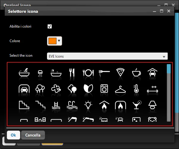
This panel lets you change the object icon. Click the icon of the selected object: the list of icons will appear, and you can choose the most suitable one.
Note. Some icons are designed for interface menus (both classic and map-based) and have a shadow that makes them ideal for menus, but it may not be suitable for a component icon.
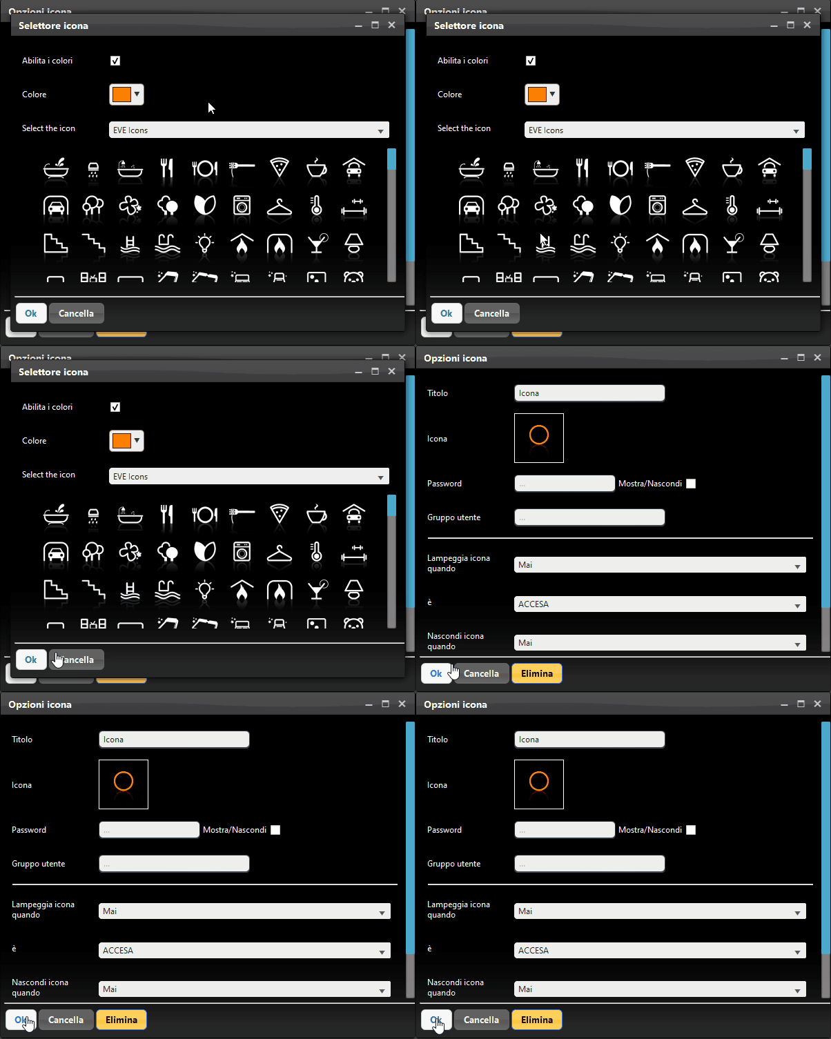
When finished, click OK: the icon will change with the selected parameters.
Note: for a component, both the name and the icon are defined in the Components section. If you change the name and/or icon from the Interface section, the change is not reflected in the Components section. Conversely, if you change the name and/or icon from the component parameters in the Components section, the change is automatically reflected also in the User Interface section. We recommend consulting the guide on “Common properties”.