Colored info
The Colored info component shows the On/Off state of a source with colored icons: properties, KNX settings and display in interfaces.
Introduction
The Colored info component shows the On/Off state of a specific source with colored icons.
Use cases
The Colored info component can be used as a status viewer for motion sensors: it changes state if the sensor detects motion.
The Colored info component can be used as a feedback component for lights and doors.
Component properties
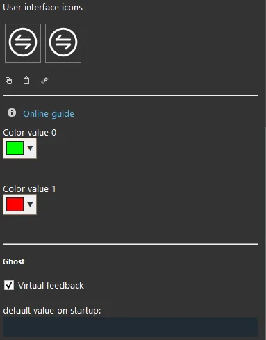
Color:
When the value is 0: choose the icon color for value 0 (left box);
When the value is 1: choose the icon color for value 1 (right box);
Default value at startup: here you can set the default value at server startup.
KNX
This component has been configured with the KNX gateway.
You can refer to the “Gateway / Protocols” guide for more information.
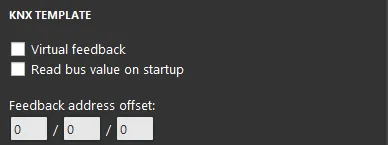
Virtual Feedback: refer to the “KNX Protocol” guide;
Read bus value on startup: refer to the “KNX Protocol” guide;
Write / Feedback address: refer to the “KNX Protocol” guide.
Three display modes: “CLASSIC”, “MODAL” and “HIDDEN”. Click the link to learn more about the display mode.
Classic display
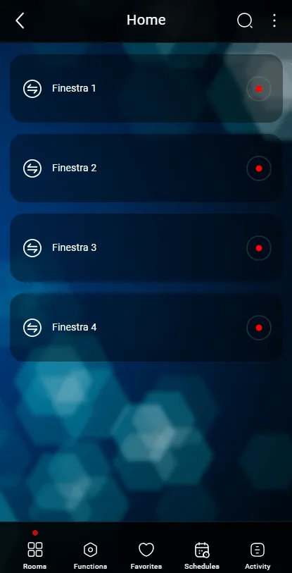
Here is the result of the component on Ilevia Control ( Classic style).
The Colored info is displayed as a square that takes the color of the corresponding value.

The default icon when the value is 0 (colored info icon, Figure 1)

The default icon when the value is 1 (colored info icon, Figure 2)
Figure 1
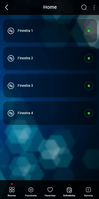
Figure 2
Map display
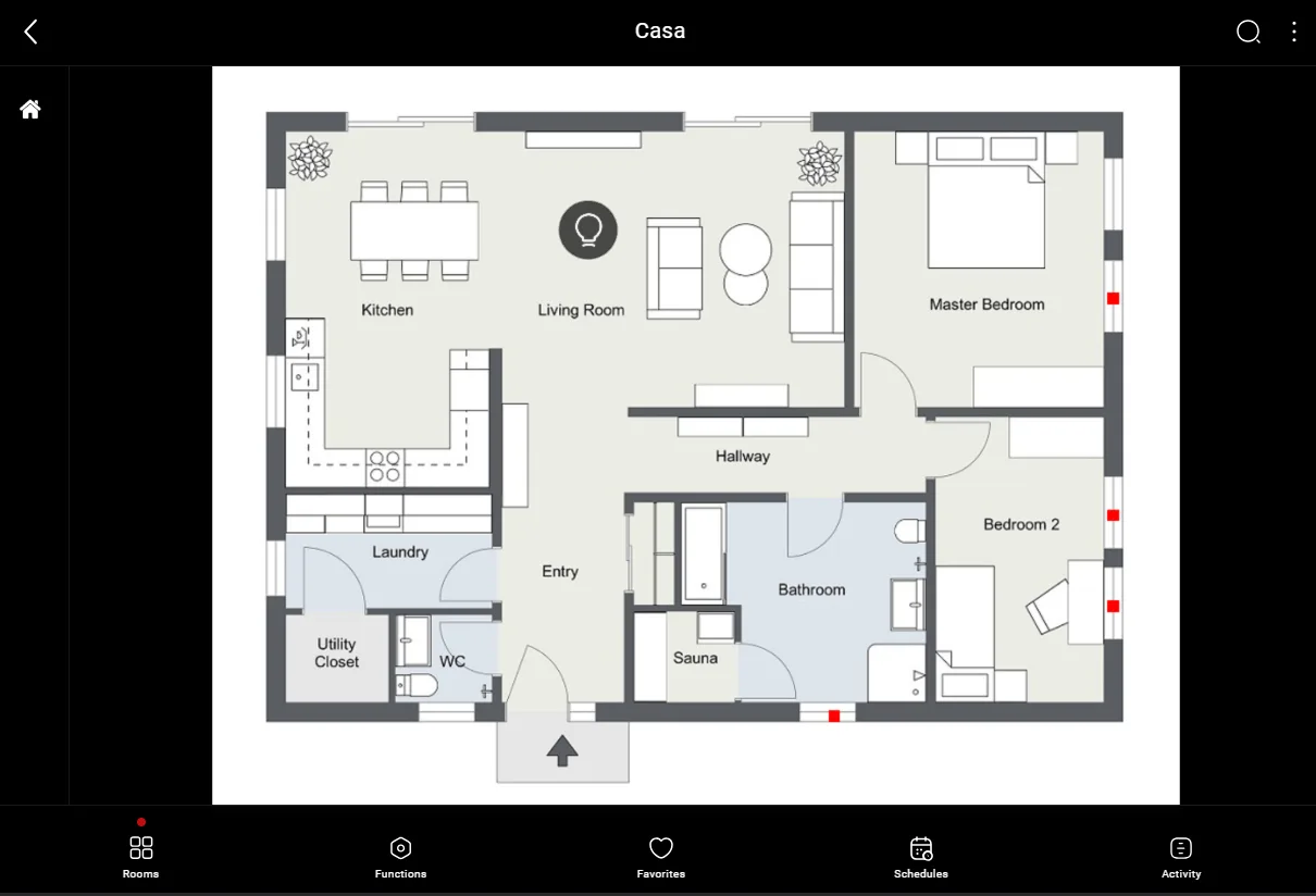
This is just one of the possible results of the component in Ilevia Control ( Map style).
The icons can be customized according to your needs: symbols, colors and sizes.
In this case, we can see the default icon:

The default icon when the value is 0 (editable icon, Figure 1)

The default icon when the value is 1 (editable icon, Figure 2)
Figure 1
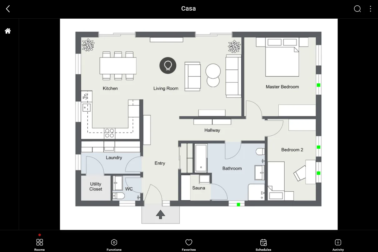
Figure 2