
Power Meter
Properties of the Power Meter component in Ilevia Manager and how to configure it correctly.
Introduction
This component is required to configure the Load Control module. You can also use it to monitor energy consumption and set alarms when the power threshold is reached.
Use cases
You can use this component to monitor the energy produced by solar panels and, at the same time, keep an eye on the energy consumed.
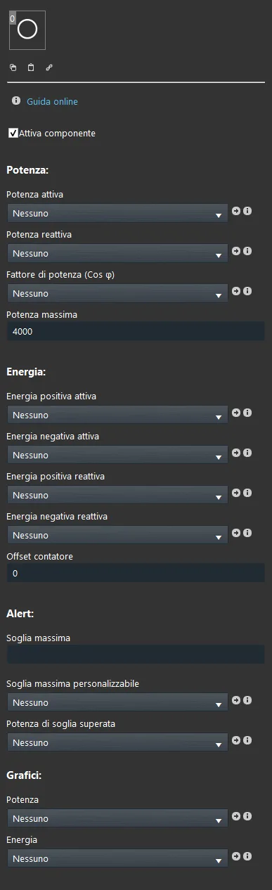
Component properties
The component title and icon are fully editable. We recommend consulting the “Common properties” guide.
GUI
This component was created using the Graphic UI gateway.
You can refer to the chapter “Gateway / protocols” for more information.
Power:
Active power: Info component referring to the active power of the running device;
Reactive power: Info component referring to the reactive power of the running device;
Power factor (cosφ): Info component referring to the power factor of the running device;
Maximum power: This value, in Watts, is the maximum power consumption value. This info can be added to the user interface to allow the user to read power data.
Energy:
Positive active energy: Info component referring to the positive active energy of the running device;
Negative active energy: Info component referring to the negative active energy of the running device;
Positive reactive energy: Info component referring to the positive reactive energy of the selected device;
Negative reactive energy: Info component referring to the negative reactive energy of the device in use;
Meter offset: Text field typically used as an energy consumption meter; in the event of a hardware failure, it can be used as a replacement.
This info can be added to the user interface to allow the user to view energy data.
Note: Text field available for additional administrator-side information.
Alarm:
Maximum threshold: The maximum power threshold above which the alarm will be sent;
Custom threshold: The Adjustable value component that allows you to change the threshold value;
This Adjustable value component can be added to the user interface to allow the user to modify the threshold.
Threshold power exceeded: The Colored info / Text info components that notify you whether the threshold has been reached or not.
It can also be a switch to activate different alarms or send an email.
This Colored info / Text info can be added to the user interface to let the user know whether the threshold has been reached.
Chart:
Power: This component allows you to create power charts using the collected information and display them in the user interface;
Energy: This component allows you to create energy charts using the collected information and display them in the user interface;
Classic view
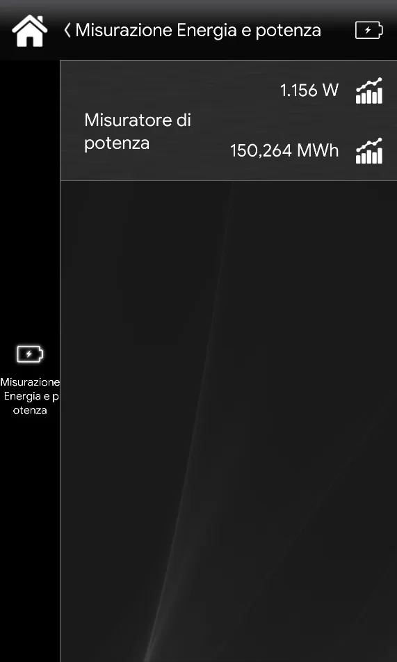
This is how the Power Meter component is displayed in the Classic user interface of the Ilevia Control app.
The first value displayed in the Power Meter component is the value related to instantaneous power

.
The second value shown is the value related to the energy produced by the photovoltaic system

.
The first Chart

shown is the chart used to display instantaneous power. This is configured in the parameter called Power under the Charts section in the Power Meter component parameters.
The second Chart
shown is the chart used to display produced energy.
This is configured in the parameter called Energy under the Charts section in the Power Meter component parameters.
Map view
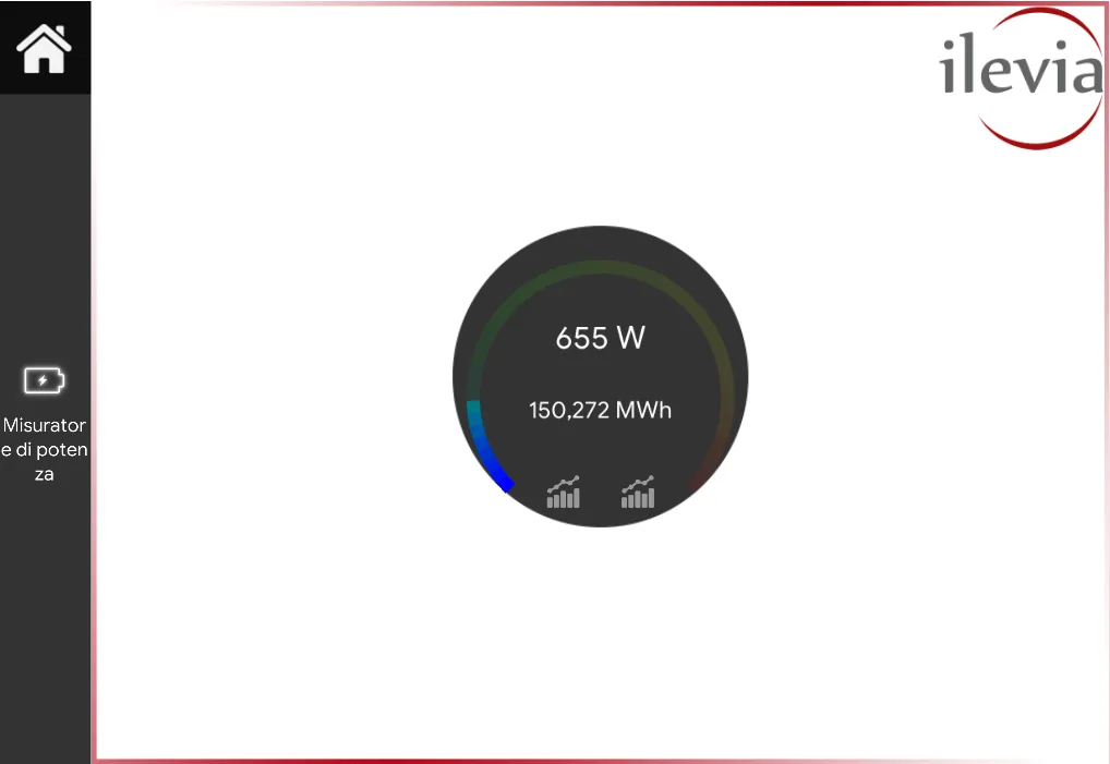
This is how the Power Meter component is displayed in the Map user interface of the Ilevia Control app.
In the Map user interface, power and energy values are displayed inside a circular frame, one above the other. First, the power value is shown

and below it the energy value

.
Finally, the two charts related to energy and power are displayed at the bottom of the frame
.
HELP
The Power Meter component can be configured simply by using the component's drag and drop function. When setting the component parameters, you can use the Options List, or add them from the “Components” section to the component selection field.
Reminder before continuing:
Download and install the Logic module to enable plugins (link);
After uploading the Ilevia project to the server, wait a couple of minutes for the logic to start.