
Text Entry
How to configure the Text Entry component in Ilevia Manager and how it appears in the Ilevia Control app, with password mode and numbers only.
INTRODUCTION
The component allows text to be entered into an Info component.
USE CASES
The user wants to build a secure switch module that requires a password for switches that turn loads on or off.
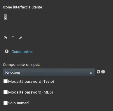
COMPONENT PROPERTIES
GUI
This component was created using the Graphic UI gateway.
You can refer to the chapter "Gateway / protocols" for more information;
Input component: select the Info component where the text will be entered;
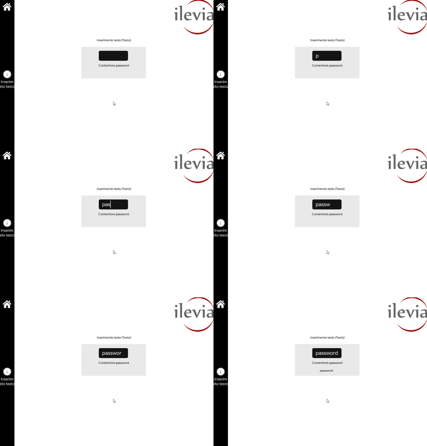
Password mode (Text): this checkbox sets password entry in text mode;
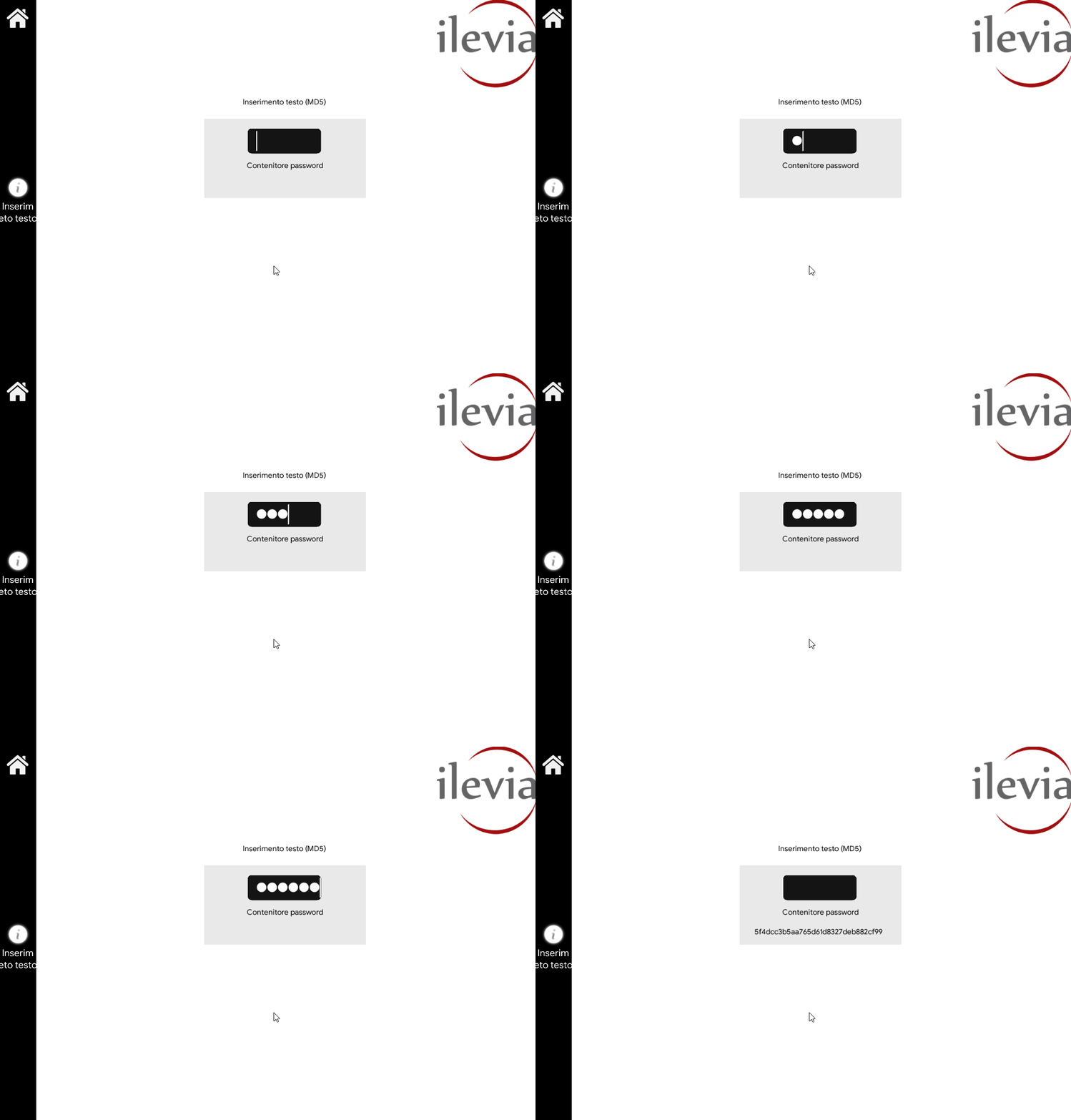
Password mode (MD5): this checkbox can be used to encrypt the text with an MD5 hash, for a password;
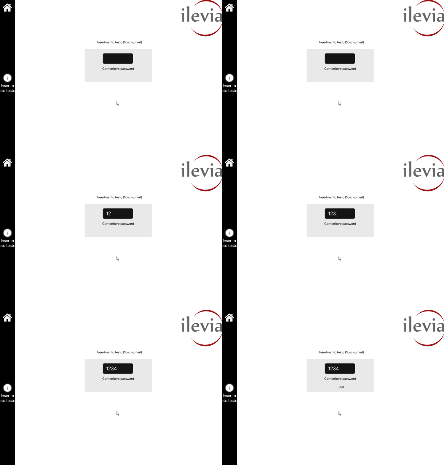
Numbers only: this checkbox sets password entry to numbers only mode.
Three display modes are available: "CLASSIC", "MODAL" and "HIDDEN". More information on the component display modes.
CLASSIC DISPLAY
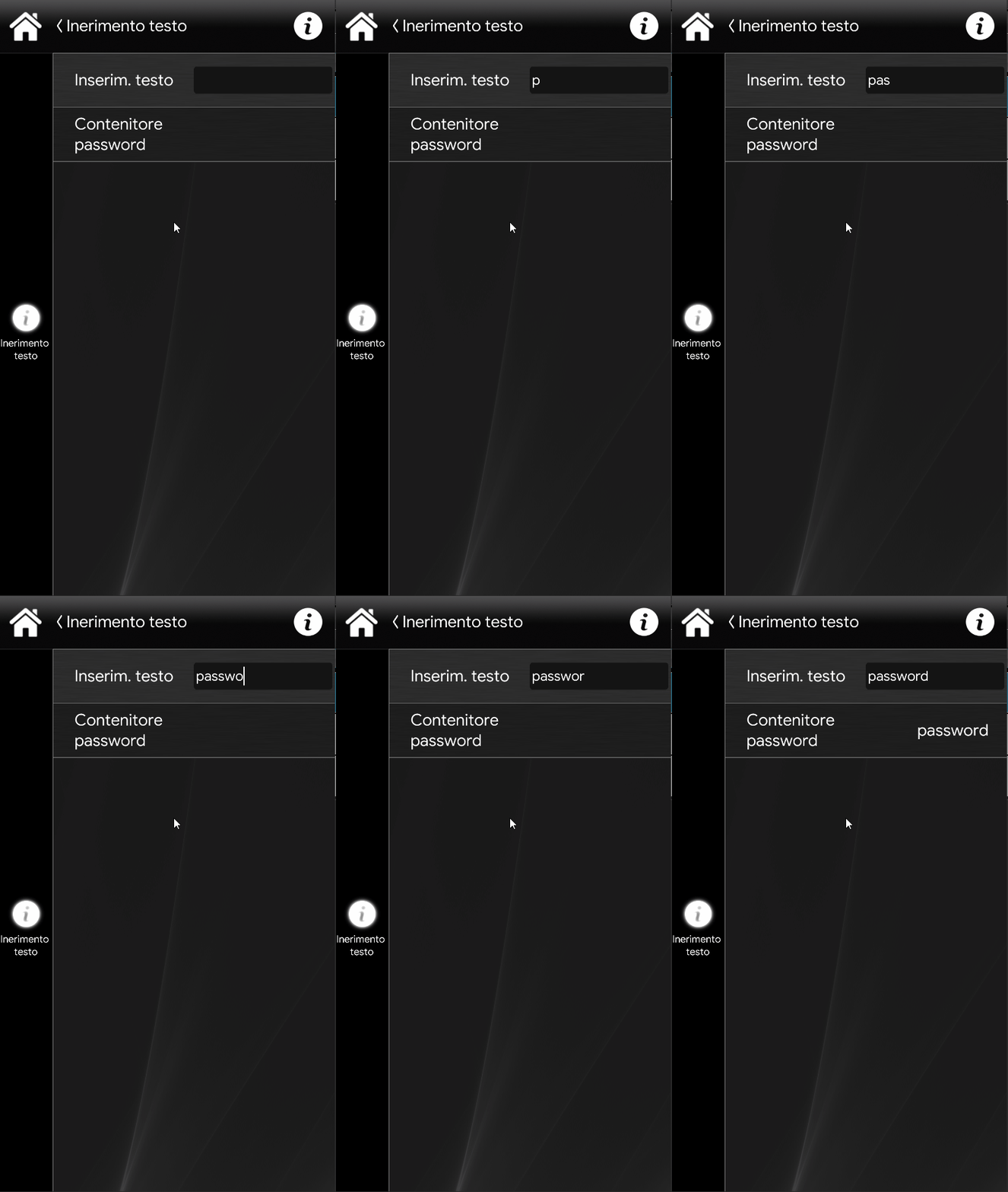
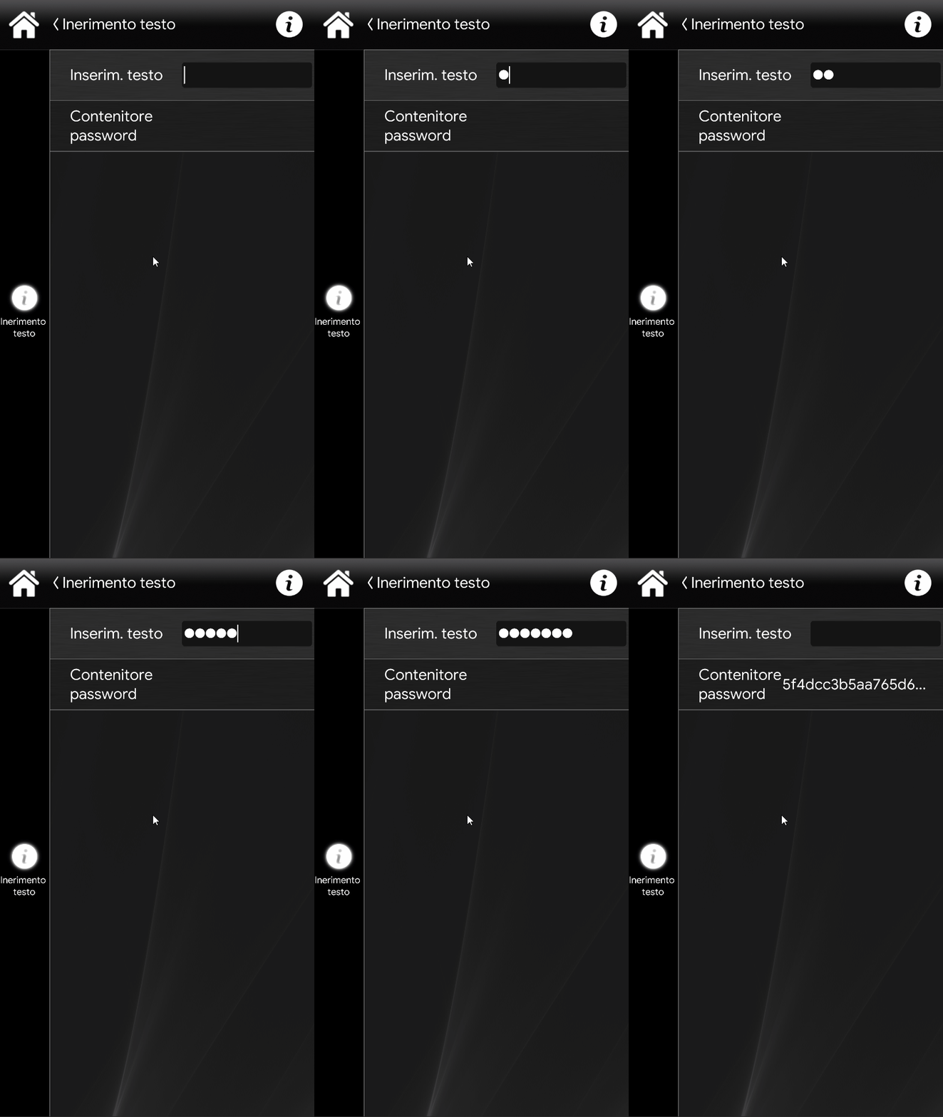
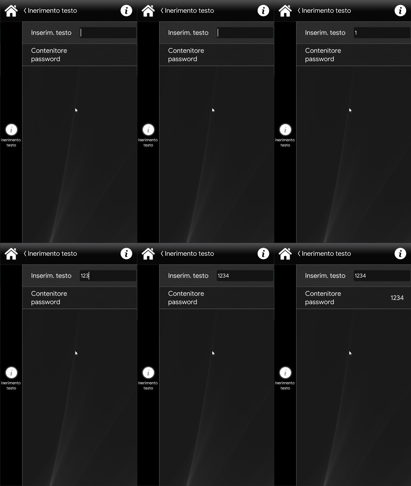
This is the visual result of the Text Entry component in the Ilevia Control app (Classic style).
By clicking the entry bar, you can enter text.
Password mode (Text)
Password mode (MD5)
Numbers only
MAP VIEW DISPLAY
This is just one of the possible results of the component in Ilevia Control (map style).
The icons can be customized as needed, from the symbol to the icon, including color and size.
In this case we used the default icons:

Empty field (Text Entry mask)
An Info component has been inserted in the interface and acts as the container for the password entered in the Text Entry component.
Password mode (Text)
Password mode (MD5)
Numbers only
Click the link to download the Text Entry component project and try it out.