List
How to configure the List component in Ilevia Manager to group multiple components into a single menu, and how it is displayed in the Ilevia Control app.
INTRODUCTION
It lets you view the selected components as a list, and lets you select different components as in a menu.
USE CASES
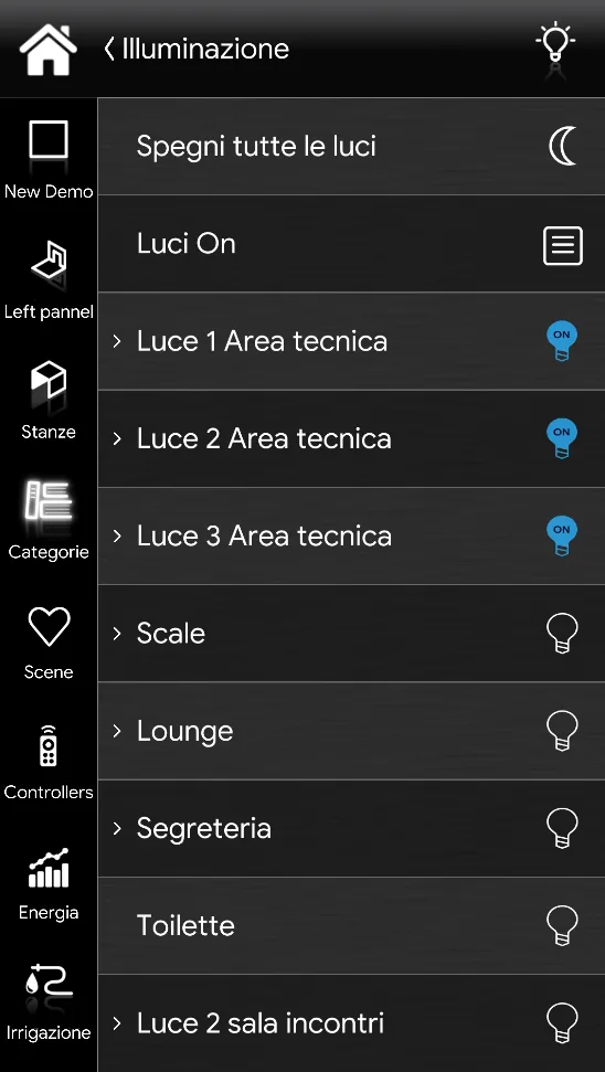
The user wants to create a compact menu, as shown in the figure below: the List component makes it possible to group a large number of components into a single menu.
COMPONENT PROPERTIES
GUI
This component was created using the Graphic UI gateway.
See the guide “Gateway / Protocols” for more information.
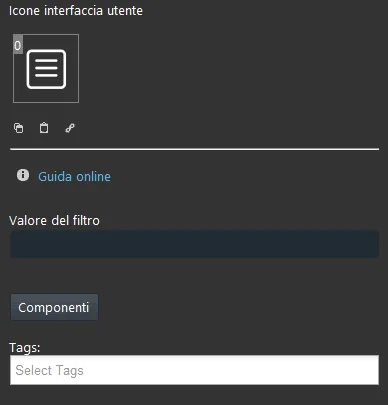
Filter value: Allows filtering components based on their value. For example, to show in the list all selected switches that are on, enter 1 in the text field.
Components: Allows you to choose the components to add. Selection is made by dragging the desired switches from the “Components” section into the components list box.
Classic view
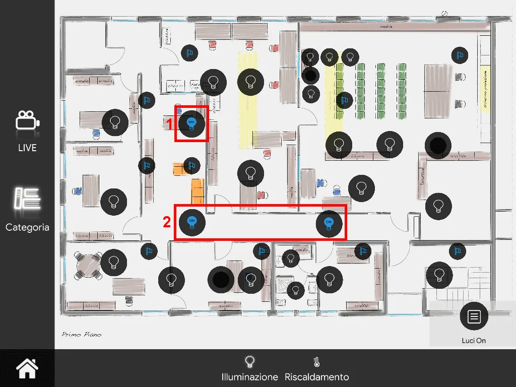
Here you can see the result of the component in the Ilevia Control app (classic style).
The List component is displayed with the following icon:
List⇒ List component icon

List icon (default icon)
Map view
Here you can see the result of the component in the Ilevia Control app (Map style).
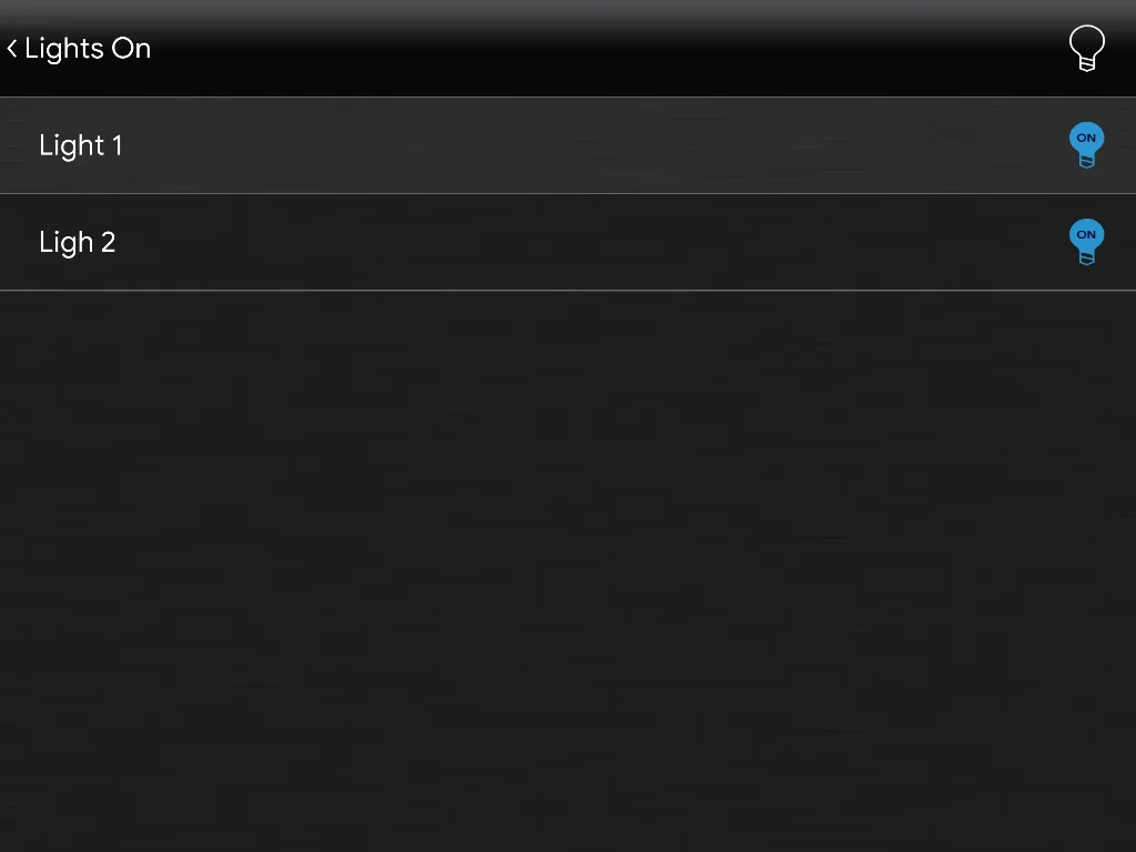
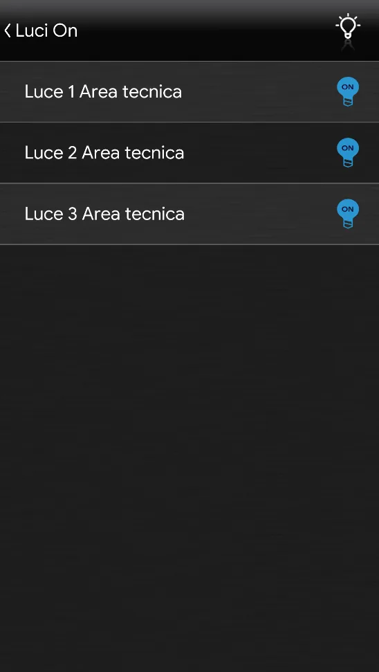
Only components with the ON status are displayed in the list, because the value 1 has been set in the Filter value field.
Once inside the List component screen, you can change the status of the components simply by tapping their icon.
The icons can be customized as needed: symbol, color, and size.
In the example below, you can see the default icon layout:
List ⇒ List component icon

List icon (customizable icon)